Ice lolly 6 pence?

FB_IMG_1593164583411

I can remember before decimalisation in the UK when money came in LSD, (pounds, shillings and pence) if you bought an icecream cone it might be 6d, which meant you paid a sixpenny piece or two thrupences 3d.

This picture is after decimalisation. Because the prices, like 6p have the new letter. I remember sixpence old money  was 2 1/2 pence in new money (we actually had coins marked as ‘new pence’).

Oh how times change! Dracula and Dalek ice lollies! I think they still sell funny faces though. As they say ‘I scream you scream, we all scream for ice-cream!’

Profile

img_20200504_041504_1365404589575594658575.jpg

Profile

You looked out in May

So proud and keen

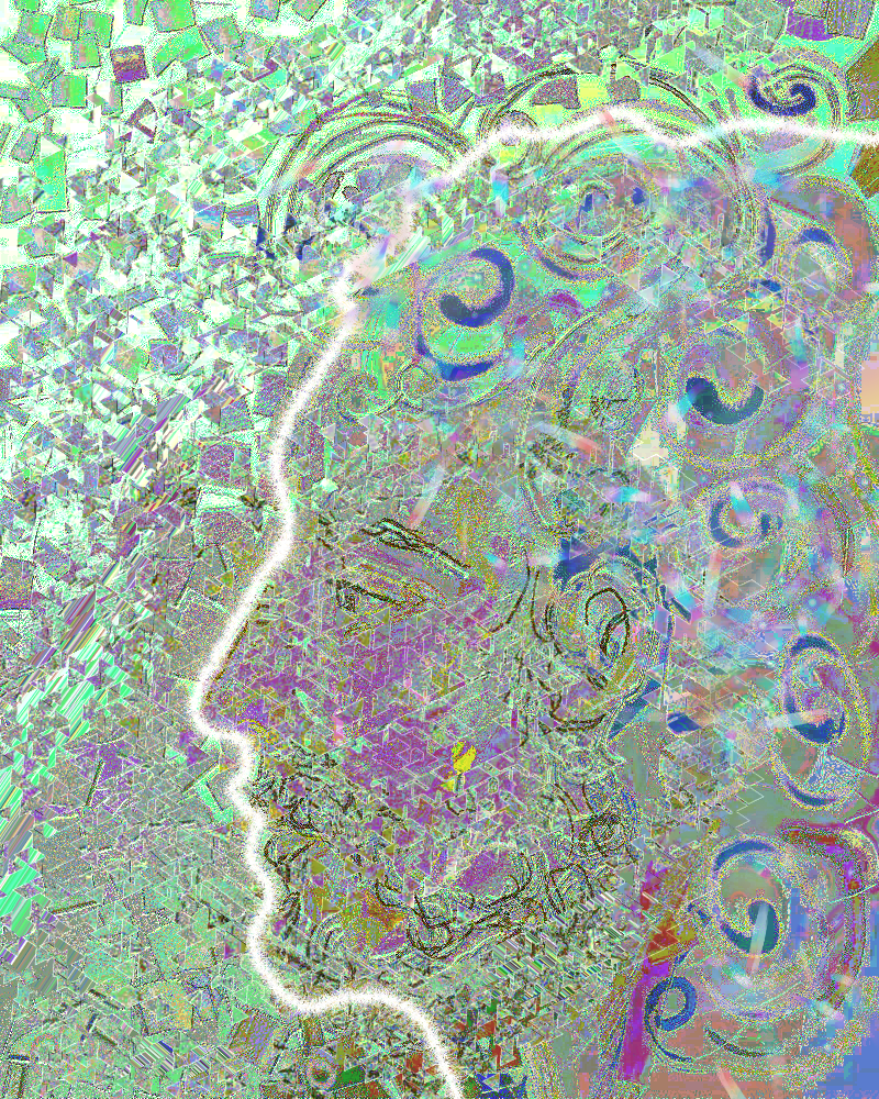
Your profile reflected in glass

In the window.

Sure you would keep safe.

The sky would not fall…

picsart_05-04-021461159800639162200.png

Now you have dissolved,

Lost your identity.

Impaled on shards of humanity.

Sifted and sprinkled

With covid 19.

Stay safe they said

As you disappeared.

Catch up with urban sketchers

Two for the price of one! The first was tonight’s sketch… Environment. It was going dark so I drew the fence with some hanging baskets, with our weather station above them. It measures wind rain, temperature and pressure. The dusky sky is visible above the silhouette of the buildings opposite.

The second drawing is spots and stripes. It was due on Tuesday 23.6.20, but I forgot. The first time through all these challenges that I missed doing one. The stripey thing is a cover on our settee. There are spotty and stripey cushions on it and a spotty lampshade. Neither drawing is articulately exciting. They are just about how and where I live..

X

Shibui

IMG_20200625_135044_123

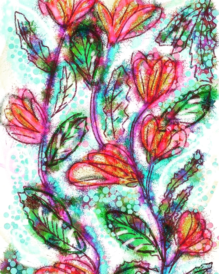
I’ve just been invited to join a page on Facebook about Shibui. A Japanese word that seems to mean calm and understated. The art there is ‘found’ with things like paint splatters or blown watercolour paint used to create images. Maybe trees, maybe flowers.

I  had a go at creating something. I used my finger to draw on my the screen and created a digital image. Using a few apps to make something interesting. I want to find out more about the art form.

My favourite Star Trek character.

FB_IMG_1592916204013

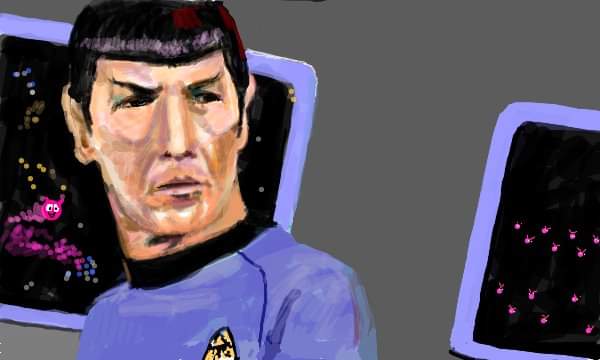
Always was, always will be. Spock. Played by Leonard Nimoy in the original series.

I quite like Zachary Quinto who plays him in the recent Star Trek movies. I haven’t seen the new outing of a new Star Trek series with Spock played by a different actor, and Captain Pike before Captain Kirk took over the part.

Anyway this was drawn at an old website called sketchfu which is sadly missed by a lot of people.

X

Face mask

selfex

I think I painted this self portrait in the early 1980’s. It’s disconcerting seeing my younger self. I used to like to hide my face away sometimes and the green face mask was fun to paint, although I remember it cracking as I painted! I did two versions as a friend bought one of them from a little exhibition I held. The other one has red and white earrings if I remember.

I know this was painted in oils on a homemade canvas. I think it was probably about 1ft square. The background was the pink wall in our room. The picture behind me was of a train by Cuneo. (not sure of the spelling). It was a print my mother got my hubby as he loves trains. I think I wore the red beret and yellow jumper to create some contrast to the green mask.

X

The moon tonight

Two images taken with the phone on my camera tonight. I took both on the manual setting on the camera as the auto choice was over exposing it. I altered the exposure so that the sky appears darker and the moon is more defined. I didn’t know how to do it. I just clicked on the tools and messed about with it. (This was the last time I took a photo of the moon and I haven’t altered the settings since).

I also had to zoom in x 5 to get a big enough image to see the moon. Then I cropped it to enlarge it. In all of that I was expecting some camera shake but its not too bad. I leant my elbow on a large glass jar on the kitchen cupboard to try and make my image steadier and I also held my breath.


They want me to use wordpress editor?

selfex

I’m an old fuddy duddy, I do things how I like to.

I try and make original paintings and write as spontaneously as I can here.

I’m getting pretty nervous of the new editor. Yes I could try it but what happens if I like this one? Will they switch it off. I’ve invested a lot of time in WordPress and I hope my blog isn’t too boring. It would be a real pain to learn it all again. I’ve got enough on my plate without having to be doing with it .

I’m getting old and cermudgenley. I’m also trying to confuse spell checker with old words!

Goodnight one and all . X

Pop art.

IMG_20200519_001309

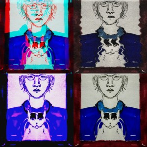
I’m playing with images again. These are vaguely based on Andy Warhol pictures in a cartoon form.

I’m reading about pop art, artists such as Roy Lichtenstein, David Hockney and particularly Andy Warhol. But there were others. Females. That have been lost in the 1960’s without the recognition they deserve. One such artist was an American nun.

From Wikipedia: “Corita Kent, born Frances Elizabeth Kent and also known as Sister Mary Corita Kent, was an American Roman Catholic religious sister, artist, designer and educator. Key themes in her work included Christianity, and social justice. She was also a teacher at the Immaculate Heart College.
Sister Corita Kent’s primary medium was silk screen, also known as Serigraphy. [4]She became self-taught after she sent away for a DIY silk screening kit.[5] Her innovative methods pushed back the limitations of two-dimensional mediums of the times. Kent’s emphasis on printing was partially due to her wish for democratic outreach, as she wished for affordable art for the masses.[6] Her artwork, with its messages of love and peace, was particularly popular during the social upheavals of the 1960s and 1970s.[7] After a cancer diagnosis in the early 1970s, she entered an extremely prolific period in her career, including the Rainbow Swash design on the LNG storage tank in Boston, and the 1985 version of the United States Postal Service‘s special Love stamp.[8] ”

If you look at her images they are very colourful sometimes using letters in various fonts. They are beautiful and interesting. Her artistic ability was wonderful and she should be recognised.