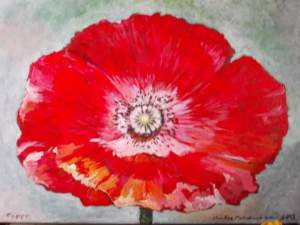
New Years Cactus

After watering these for a few weeks they are blooming. Christmas Cactii that I have on the kitchen windowledge. They don’t all flower at the same time. There has been a progression that started with a dark pink one before Christmas, then a pale white/pink coming up to new year and now these two. I’m not sure whether the light levels affect the flowering. I know I have one that won’t flower till sometime around Easter (if it’s an early Easter). I realise some people don’t like plants in the house, but to me it’s more about adding greenery to your life. The Cactii cheer me up. X

Sailing

I wanted to use the ‘knitting’ pattern that I had drawn as a background for another image. Flip it over, mirror it and crop it, draw over it and add a boat and its reflection. I think it actually works quite well. The sea looks calm as a mill pond despite the wind catching in the boats sails. I added white lines to dilineate the surf as it flows onto the beach.

Red and black with white.

Some sketches from last year. Using various amounts of white along with red and black. I think I added white to make the images easier to see and read. The red is quite a dark tone and it’s hard to see against the black areas. I also think someone who is colour blind might be able to see the images with more white.

Fish

My watercolour of goldfish I did this April. I just came across this while I was looking back at my previous art.

I was talking to someone yesterday about letting white paper come through in watercolours. I rarely soak the paper before I start painting and I frequently mix up strong colours, leaving patches of white where I want to show light coming through. The way I think about it is that I can control the paint without having to use masking fluid… And it’s cheaper tgan using white paint or gouache.

Moon

One moon, high above the clouds. Seen on a walk, popping up like a bubble from the lips of a cloud.

It’s hard to capture the moon on my phone. The definition of the photo is not good, and having to zoom in makes it more blurred. I think I avoided too much camera shake.

It’s not often you see the moon in the sky in daylight. But I like this photo. Simple view and with the clouds it makes it more interesting.

Colours

So colours represent specific emotions? Maybe? But who sets them. Is it a historical thing? Some countries have black as their colour of mourning. But others use white, and who knows what else might be favoured elsewhere. Red is hot, fast, speed, fast cars are often red. But what about red for danger. Traffic lights, live wires and of course blood? But red can be sweet like fruit too.

Green has been found to be calming, and maybe blue too. Linked with the colours of growing plants. Green indoor plants can calm workers. Now green walls of plants are fashionable.

Pink for girls, blue for boys. But a couple of hundred years ago it was the other way round. Perhaps our use of colours to represent emotions is just fashion and fad!