
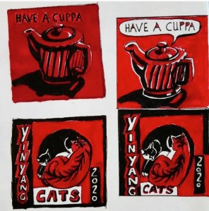
Some sketches from last year. Using various amounts of white along with red and black. I think I added white to make the images easier to see and read. The red is quite a dark tone and it’s hard to see against the black areas. I also think someone who is colour blind might be able to see the images with more white.
