Tired from painting

IMG_20200630_184527_355

I’ve been painting a lot over the last few days. I was up till 5am, went to bed but then got up at 11am so I’m really tired. I thought I would take a photo of what I’ve been doing. You can see the contrasts in size. When I took this photo I didn’t know the kingfisher would be sold two hours later. It’s now at a good friend’s. I’ve been asleep half the evening. I wish I had more energy.

As you can see my ideas are many and varied. I was going to do a craft fair this weekend but decided against it as I don’t think it’s safe enough and I’m not happy to risk being out in public. Hopefully I will be able to do another one. Also it’s not a good idea to sell you stock prior to an event. I’m going to do some more but I need a decent night’s sleep!

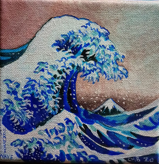
Wave, after Hokusai

_20200629_220225

Hard to copy, this is a small acrylic on canvas, based on the Japanese artist Hokusai’s picture of a massive wave seemingly threatening mount Fuji and boats fighting the turmoil of the water.

How does he draw that wave? Finger like  curves protrude from the water, white wavelets curve all in one direction. The water becomes a threatening mountain about to collapse. The height of the wave threatens not only the people in the boats, but it even dwarfs Mount Fuji itself.

When did he draw and paint it? He was a famous artist I think for a long time. We’re there other pictures and sea in his career? I think there were.

The image is so well recognised. Type in 🌊 wave on your phone and you get an icon which seems to symbolise Hokusai’s wave and mimics it.

How do you analyse such amazing work. How can you understand it. He makes me wish I could copy his style.

Ice lolly 6 pence?

FB_IMG_1593164583411

I can remember before decimalisation in the UK when money came in LSD, (pounds, shillings and pence) if you bought an icecream cone it might be 6d, which meant you paid a sixpenny piece or two thrupences 3d.

This picture is after decimalisation. Because the prices, like 6p have the new letter. I remember sixpence old money  was 2 1/2 pence in new money (we actually had coins marked as ‘new pence’).

Oh how times change! Dracula and Dalek ice lollies! I think they still sell funny faces though. As they say ‘I scream you scream, we all scream for ice-cream!’

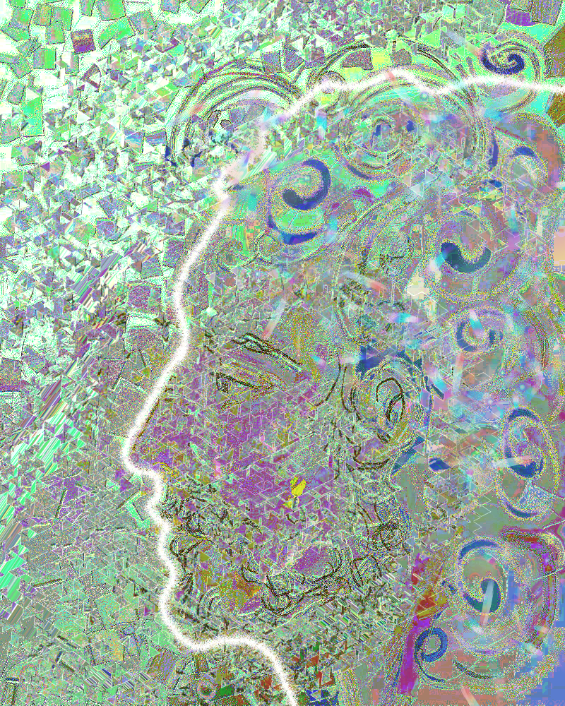
Profile

img_20200504_041504_1365404589575594658575.jpg

Profile

You looked out in May

So proud and keen

Your profile reflected in glass

In the window.

Sure you would keep safe.

The sky would not fall…

picsart_05-04-021461159800639162200.png

Now you have dissolved,

Lost your identity.

Impaled on shards of humanity.

Sifted and sprinkled

With covid 19.

Stay safe they said

As you disappeared.

Betrothed

_20200618_000315

Well this is interesting, I have got to draw a picture using a few symbols based on my alphabet idea. (I had to choose different symbols to illustrate each letter of the alphabet). The challenge only allows me to use the symbols for three letters. I have to come up with an image based on the word betrothed….

It’s going to be hard to come up with an illustration to represent it.

I also have to draw something to the idea crocodile eggs….. I’m not sure what I will do! Wish me luck!

X

Art…

_20200510_012931

The Sunday Times newspaper has run an article which compares essential and non essential workers.

Their survey had a list of images, essential has doctors I think at the top, and artists at the top of non essential jobs. So it says artists are the least essential workers?

I feel this argument should be challenged.

So no one ever designs things using their artistic skills, or paints scenery, or designs art for their walls, or cars, or wallpaper, or covers for books, or diagrams for science books, or medical textbooks. Or designs for online gaming art, or creating beautiful jewellery, or clothes or shoes. Or patterns on China and pottery. No art is used in news papers to show images of essential or non essential workers, how could anyone be employed to illustrate anything? No one ever read a cartoon or a children’s book! Obviously……! No one ever drew rainbows for the NHS. Children don’t need art to learn how to understand biology or architecture or any other complex concept. Richard Feynmann and Steven Hawking never used pictures to explain their theories of quantum mechanics. What about technical drawing? But… statues are now grey boxes, Leonardo is a turtle…. And he was never drawn!

The cat sculpture is happy

DSC_2701

The cat sculpture by Charis Jones, of Sculpted Steel based at the Forge at Etruria, Stoke-on-Trent, has settled nicely into the greenery of our garden. It stares out from between geraniums and lilies. The light glints on its glass eyes and shows off the lovely green coppery finish.

I don’t commission art very often, but Charis translated my two dimensional drawing into a remarkably beautiful cat. Proud and purrfect. It’s crinkly whiskers full of character. I’m pleased to possess it.

X

Necklaces

FB_IMG_1580825866108

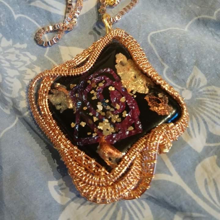
I got some of my necklaces back from a gallery that closed down last week. Most of them are quite chunky. I had a few small ones that were being made (my friend does wire weaving) but with the lockdown I haven’t been able to get some of them back.

I promised a couple to friends and I’m very disappointed they haven’t been able to have them yet. It’s only because of covid 19 that I haven’t been able to pass them on.

Alphabet?

DSC_2679

Part of my study is to come up with patterns or shapes to indicate individual letters. You are supposed to use shapes you sketch with or others that fit into a usable vocabulary of marks. I shade a lot but also use dots and dashes. I have added straight lines and spirals. Some squiggles. I wonder if I should have added curves or ellipses. It’s hard to decide what shapes to use. I wanted things to be quite organic, and I’ve used various pens to see how each would look.

I may have completely got the wrong end of the stick, but I’m hoping this is what they want. Perhaps I should have made it neater. Not sure.

X

Changing pictures with filters

In this case I drew the image on the left in photoshop years ago it’s me in the style of an Escher drawing. Today it popped up in my memories in Facebook so I decided to see how it would look if I put it through the photodirector app. I used a tool called style. You have a choice of six options, and I think I used the second one for this.

I like the way it concentrates the lines in places and gives it a sharper look. But I do prefer the original… Substance over Style?