Stained glass view

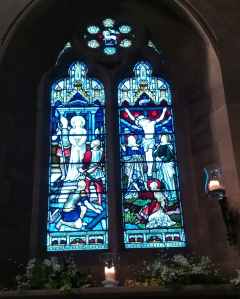
A few weeks ago we visited Rode Hall and the church across the road from it. I was running out of battery power so only took this photo. I just decided to look at it again because I like the colours in the glass. Blues, reds and whites highlight the figures and the textiles and architecture. The detail of the pattern at the top and base of the window panes help link each panel together. Just cutting the glass pieces out must have been so difficult and time consuming. Using lead to hold the glass in place. How do artists manage to do this? I’m full of admiration.

Tulips

Not this years ones, they haven’t opened up yet. But they are starting to grow up. I just can’t wait. I’m used to waiting for spring but sometimes it seems to take an awful long time to get here. A couple of weeks ago the temperatures were in the high teens Celsius, last week they dropped to freezing or below, and there was a snow in a few places across the UK. We didn’t get more than a bit of hail and snow here. Meanwhile the daffodils and snowdrops are up. We haven’t had much rain though, so the buds on the trees are not fully open yet…

Spring

Today’s #bandofsketchers prompt was Spring. I decided it was too cold to stand outside and draw daffodils so I decided to draw one from memory. Also couldn’t get my sketchbook page flat so it’s a bit curved… I have some with very strong orange trumpets and bright yellow petals so I think these colours are close.

Patterns again

My brain likes pattern and complexity. I cannot abide plain white walls with no embellishments. Even my writing can be flowery? Is it because I’m interested in all sorts of things? I’m very visual, and yet I can walk past a friend without noticing them! I don’t have that face blindness thing that some people have. I think my glasses frames sometimes blocks the view.

Life is so difficult in the world at the moment. I am feeling a bit low with everything happening. But I pick up a felt pen and draw and time FLIES so fast.

Yellow purple complement

Playing with complementary colours. I like red/green and blue/orange but a favourite is this combination yellow/purple. I yexturised the original pattern then mirror ed two of each, original and textured. Interestingly the colours seem to change as I used the texturising filters so I put them through Instagram to boost the intensity of the colours. It’s just a fun pattern.