Shibui

IMG_20200625_135044_123

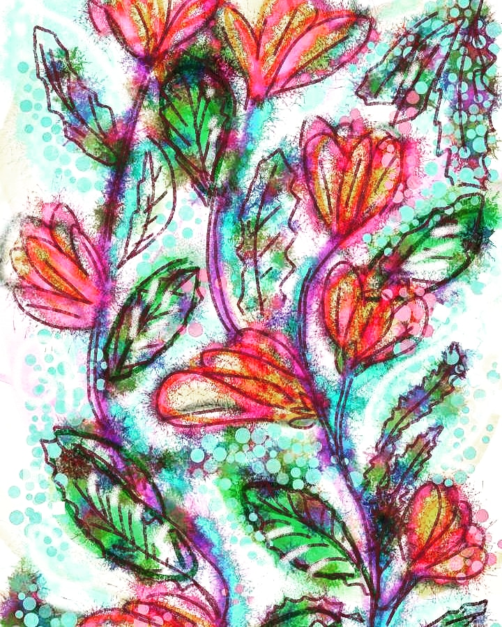
I’ve just been invited to join a page on Facebook about Shibui. A Japanese word that seems to mean calm and understated. The art there is ‘found’ with things like paint splatters or blown watercolour paint used to create images. Maybe trees, maybe flowers.

I  had a go at creating something. I used my finger to draw on my the screen and created a digital image. Using a few apps to make something interesting. I want to find out more about the art form.

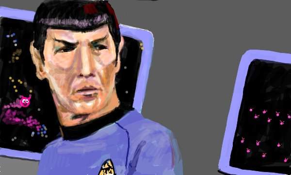
My favourite Star Trek character.

FB_IMG_1592916204013

Always was, always will be. Spock. Played by Leonard Nimoy in the original series.

I quite like Zachary Quinto who plays him in the recent Star Trek movies. I haven’t seen the new outing of a new Star Trek series with Spock played by a different actor, and Captain Pike before Captain Kirk took over the part.

Anyway this was drawn at an old website called sketchfu which is sadly missed by a lot of people.

X

Face mask

selfex

I think I painted this self portrait in the early 1980’s. It’s disconcerting seeing my younger self. I used to like to hide my face away sometimes and the green face mask was fun to paint, although I remember it cracking as I painted! I did two versions as a friend bought one of them from a little exhibition I held. The other one has red and white earrings if I remember.

I know this was painted in oils on a homemade canvas. I think it was probably about 1ft square. The background was the pink wall in our room. The picture behind me was of a train by Cuneo. (not sure of the spelling). It was a print my mother got my hubby as he loves trains. I think I wore the red beret and yellow jumper to create some contrast to the green mask.

X

They want me to use wordpress editor?

selfex

I’m an old fuddy duddy, I do things how I like to.

I try and make original paintings and write as spontaneously as I can here.

I’m getting pretty nervous of the new editor. Yes I could try it but what happens if I like this one? Will they switch it off. I’ve invested a lot of time in WordPress and I hope my blog isn’t too boring. It would be a real pain to learn it all again. I’ve got enough on my plate without having to be doing with it .

I’m getting old and cermudgenley. I’m also trying to confuse spell checker with old words!

Goodnight one and all . X

Pop art.

IMG_20200519_001309

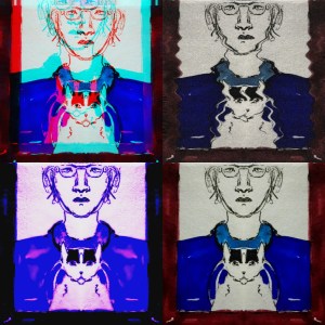
I’m playing with images again. These are vaguely based on Andy Warhol pictures in a cartoon form.

I’m reading about pop art, artists such as Roy Lichtenstein, David Hockney and particularly Andy Warhol. But there were others. Females. That have been lost in the 1960’s without the recognition they deserve. One such artist was an American nun.

From Wikipedia: “Corita Kent, born Frances Elizabeth Kent and also known as Sister Mary Corita Kent, was an American Roman Catholic religious sister, artist, designer and educator. Key themes in her work included Christianity, and social justice. She was also a teacher at the Immaculate Heart College.
Sister Corita Kent’s primary medium was silk screen, also known as Serigraphy. [4]She became self-taught after she sent away for a DIY silk screening kit.[5] Her innovative methods pushed back the limitations of two-dimensional mediums of the times. Kent’s emphasis on printing was partially due to her wish for democratic outreach, as she wished for affordable art for the masses.[6] Her artwork, with its messages of love and peace, was particularly popular during the social upheavals of the 1960s and 1970s.[7] After a cancer diagnosis in the early 1970s, she entered an extremely prolific period in her career, including the Rainbow Swash design on the LNG storage tank in Boston, and the 1985 version of the United States Postal Service‘s special Love stamp.[8] ”

If you look at her images they are very colourful sometimes using letters in various fonts. They are beautiful and interesting. Her artistic ability was wonderful and she should be recognised.

I saw a face

IMG_20200623_154932_010

I saw a face,

I blocked out some of the photo, and added some lines to the result in a sympathetic green colour. The blue mecanopsis flowers form stunning eyes, the concave petals give it depth. The dark purple makes the mouth and upper lips. It’s a almost insect like, perhaps like the head of a dragonfly? I can see antennae on it. It’s something I enjoy doing, playing with images.

X

Tribute to Monet

FB_IMG_1592922533853

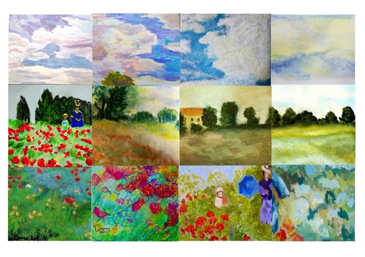
I’m one of twelve artists from the Orme Art group who did this picture of Monets Poppies at Argenteuil. Mines the middle one on the left. I used permanent markers and coloured pencil. Others used paints including acrylic and watercolours. It’s good to collaborate.

What I like about this is the different styles and colours. It sort of brings a modern feel to a classic painting.

We have a large field nearby that has a similar aspect, on a slope and edged with trees and hedges. The area is under threat of development although it is quite an ancient piece of farmland. I hope it can be saved. Its called the Croft and its beautiful.
X

Vintage

_20200621_150607

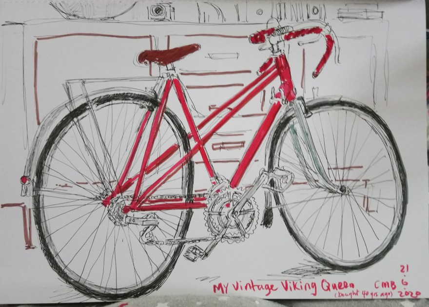
This was today’s Urban sketchers challenge. Vintage.

My vintage Viking Queen mixtie bike.

Drawing this quickly it makes me realise how hard it is to draw accurate ellipses. This was the bike I bought a few pounds a week from Swinnerton cycles in Hanley, Stoke-on-Trent, Staffordshire, forty years ago. I used it till I was knocked off and fractured my skull. I carried on riding it for a year, but it collapsed because the headset had been damaged in the crash. I took it to be mended and the shop lost the frame. I bought a new bike, but it was the wrong size for me. (my legs are slightly short). I ended up giving the new bike to a friend and learnt to drive. Big mistake. I got my old bike back rebraised about a year after I took it in to the shop. From then on I put on weight. I carried on cycling occasionally, but mainly used the car. The last time I rode my bike was about ten years ago. I’m scared to get back on it as my balance is not good. But I keep it, thinking one day I will have another go….

X

Pattern

IMG_20200531_122912_296

I drew this a few weeks ago. Now I’m thinking it would make a good design for some cotton material, maybe a panel on a tee shirt or a pair of trousers. I actually have a pair in black and white that is similar to this. It’s amazing what you can do with a black ink pen and a bit of technology. I just need to find someone to work with.

If you know any innovative art sites that do printing let me know. I did think about joining somewhere called spoonflower but I wasn’t certain about it.

X

Poppies continued..

Here’s my attempt at my square (5) of the poppies painting. As you can see the image I was working from had a great big yellow five in it, so I ignored that. On the original photo the colour balance is more muted, but somehow on the one I was coding from the grass is quite orange. I decided to draw with felt pens, permanent markers and coloured pencils. It’s obviously too green, but it’s hard to layer up colour with pencils, they go shiny and form a waxy surface. After I finished this I added a few streaks of orange ermanent marker but they are too defined, so I left it at this. Positioning of the figure and hill is difficult. Hope when it’s added to the rest it will be OK.

X