More ‘scales’

More experiments for my dragon project. Converting one of the patterns to black and white gives me an idea of how it would look if I had not got full colour options. I can still create complexity and light and shade even in different greys. Duplicating and mirroring are used again to add intricate patterns. I shall save these for possible use.

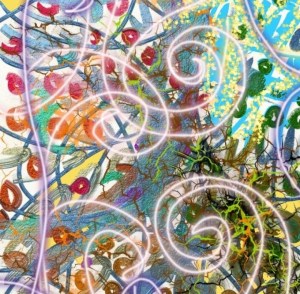
Swirls

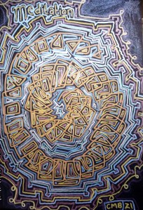
Swirls drawn digitally. Artrage oils and photodirector. Draw swirls then play with editing options. You can do all sorts of things with digital apps. I feel like this is a little like a coral surface or a Mandala.

Pattern again, my thing, I suppose I will never get enough of it. Something happens in my brain and I have to do this. I’m addicted to art and patterns. I love convolutions.

Sailing

I wanted to use the ‘knitting’ pattern that I had drawn as a background for another image. Flip it over, mirror it and crop it, draw over it and add a boat and its reflection. I think it actually works quite well. The sea looks calm as a mill pond despite the wind catching in the boats sails. I added white lines to dilineate the surf as it flows onto the beach.

Scales?

Covered in armour

Impenetrable scales

Against all drama

Arrows and staves

Flying above

Crawling below

Graceful as a dove

With a loud bellow!

Only a myth

An imaginary creature

Family kin and kith

In which lizards feature

Wings full of woe

Mouth full of fire

Where he does go

Things will be dire!

What is this thing

We wish will be gone?

Of it we will sing!

The inimitable Dragon!

Red and black with white.

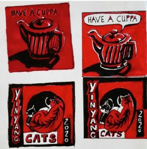
Some sketches from last year. Using various amounts of white along with red and black. I think I added white to make the images easier to see and read. The red is quite a dark tone and it’s hard to see against the black areas. I also think someone who is colour blind might be able to see the images with more white.

Fern leaves

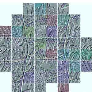
I can’t remember how I got this image, I know it’s based on a photo of fern leaves and I must have used layout to mirror the patterns. But how I added the various colours and added the tiles? I can’t remember. And just how did I get the embossed effect…. It must have been an app I no longer have on my phone. A puzzle, which is what the image looks like.

Texturised

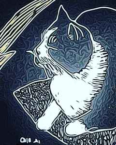
I used photodirector to adjust the textures in the effects part of its editing tools. I like the rippled effect, it somehow reminds me of the patterns in the cloudscape on Jupiter taken by the Juno probe a few years ago. Because I didn’t shade all the way up to the outlines I like the dark edge that lies between them and the silver shading. I could imagine using this style to illustrate a book cover or within a magazine article. Perhaps one day I will get a commission to do something like this? I don’t know.