Sprigs of spring?

IMG_20190807_180522_optimized

In months my garden

will be aflower,

floral fancies,

blooming anew.

But sadly now

the sight is of grey hue.

Cold sprigs of twigs

leaden coloured,

deadened stems.

Give them some sun,

some warmth

some food?

Then they will improve their mood.

I wait and cry

with many a sigh,

Looking around

For colour on the ground.

Daffodils and Tulips

Crocus and Snowdrops.

Then Bluebells and Violets,

will stir the air,

colours will flare!

Brighten the world,

set bees abuzz,

and waken my love,

of nature.

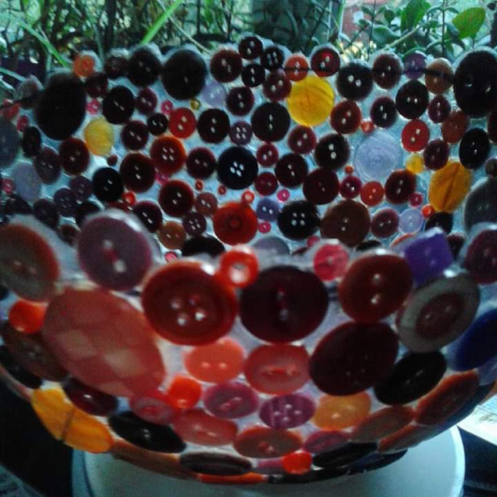
Button bowl

FB_IMG_1580825976558

I got this last year. Its a bowl constructed of buttons stuck together with PVA adhesive. It was made by a friend who used a bowl as a form to make its shape. The only thing is that it has deformed slightly because it was pushed into by another object.

I like her choice of colours and the way you can see the gaps between the buttons. I don’t think it will last forever. Perhaps it will turn into a forlorn heap of buttons, but it’s OK for now.

X

Layers of a collage.

From two years ago. Turning a drawing into a collage using Christmas wrapping paper, tissue paper and a shiny, metallic party bag.

I layered up the paper using dark urple tissue paper over a pale background to try and give the idea of silhouetted trees. Having stuck the purple colour down I then cut out the metallic paper to simulate the wire mesh fence. When I cut out the tree shape I wanted to give a feeling of the texture of tree bark. Finally I added paper on either side to act as curtains.

This was at an interesting collage workshop with the Orme art group about two years ago. I enjoyed learning a new skill.

Vision

Today’s challenge on 64 million artists January challenge was to choose the sense that is most important to you.

To me my sight is the most important sense, the ability to discern colours and use them in interesting ways…..

These are a couple of digital art drawings I did on ArtRage oils and Layout a year ago. I played with colours and textures.

X

Blue and yellow.

DSC_2216

I love the colours in this photo which I took at the British Ceramics Biennial held in Stoke-on-Trent last year.

I like the triangular patterning on the body of the pot, and the shape of is neck. I think the blue glaze is painted by hand. I love it. The yellow table surface is a brilliant contrast, making the pot stand out well against it. These primary colours are a lovely combination. 

Table cloth

DSC_2391

Saw this bright and breezy tablecloth in a cafe today. I don’t know who designed it so apologies for using it. I really like sign writing and shaded letters so this appealed to me. It’s neat and tidy and eye poppingly colourful, with primary yellows and orangey reds. The dark and light blues add contrast, and the whites tie it all together. Is this surface pattern or graphics, or a mixture of both.

X

Sunset sketch

Untitled74_001

I wanted to do a colourful sketch of the sunset which was all oranges and purples. I can’t get it exactly right as it is drawn in ArtRage oils, basically it’s a finger painting. I got the idea from a photo by a friend on a Facebook page, but as it’s just an impression there is no point in sharing the photo as this is much more impressionistic than the original.

Drawing digitally.

Untitled67_001.jpg

I haven’t done much digital drawing lately. This was done in the free ArtRage app. I was just messing around with complementary colours, in this case red and green. I might lay around with hues and tones in a later iteration of this. It’s only a finger painting really, using metallic and non metallic digital paints.

I should try and copy a photo or use the other ArtRage app I have which is the pro version. I also could play with photoshop. I will think about it when things quieten down a bit.