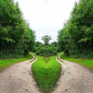
I see an alien, green figure in this landscape. By playing with filters you can get surreal effects. I think this had a feeling of ancient topiary. I used a texture and mirroring filter to change it and make it more interesting I hope.

New paintings and regular art updates.
I see an alien, green figure in this landscape. By playing with filters you can get surreal effects. I think this had a feeling of ancient topiary. I used a texture and mirroring filter to change it and make it more interesting I hope.

Acrylic on canvas, a few more layers. The rough edges of his coat, where they touch the grass, need sorting out. The dig has got a silver coat and a collar and lead on which I’ve left out so I’m trying to decide where the shadows should fall and his fur. I think I’ve made some of it too yellow, I need daylight to check.
Abstract based on a green man jardinaire seen in Yorkshire and done using my old phone texture software (crude but it made interesting patterns). I actually miss it, I haven’t found anything that does it anymore.
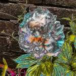
Paeony or Peony? How do you spell it. I changed this photos texture in Photodirector, then changed its hue and saturation and finally used the curve tool to adjust the lightness and shadows. I feel it has a look of embroidered silk or satin. The petals are more defined than the original white flower. I like the yellow and blue greens on the leaves. If this was the true colours I would say that it was an ill plant. But as this is an edit of the original I think it gives an interesting effect.
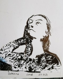
The monoprint was made by rubbing paper onto black paint brushed onto silver foil and then scratched through a bit. I then cut out a shape to fit to the shape of the woman body and arm, side of the face and hair, (basically the shaded side of her face and body). This was a bit nerve wracking as I only had ten minutes to do the cutting out, sticking, and drawing the rest of the portrait. I used the monoprint from a stock of them I’d made already.

I’ve drawn a cat on a window ledge in front of a net curtain, its black and white and drawn with Autodesk Sketcher app and ArtRage app. But when I’ve tried to change the image size wordpress is saying media not found, so this image may not show up on the post… I’m publishing it these what happens…

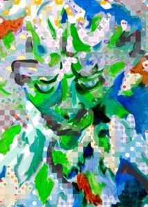
Looking out of the screen, sad eyes, sad mouth. Playing with textures can change how we view an image. Somehow most of the face is similar to the background, but the eyes and mouth are less distorted. But the nose seems to de disappearing…

I love playing with things as you know. I add textures or add colours, mirror things or duplicate them. Art is exciting. Not every image is good, some work, others don’t. But playing with things helps you learn new things. Scientists experiment, that’s how they changed from Alchemists to chemist’s or physicists or biologists or mathematicians. They took things and learnt how they worked. That’s basically what I hope I do. Maybe not as logically or not done in an organised way, but I try.

A digital drawing that I used texture and flood fill on. I feel like the result is somehow alien, maybe some sort of spiritual feeling. Maybe it’s the colours that seem like stained glass. The purple coming down the nose reminds me of a helmet with light shining on it. The front of the body could be interpreted as a chest plate or armour.
When you are adding texture it’s interesting to decide when to stop. The same with the flood fill. Too much or not enough? I think you learn as you go along what sort of image you want.
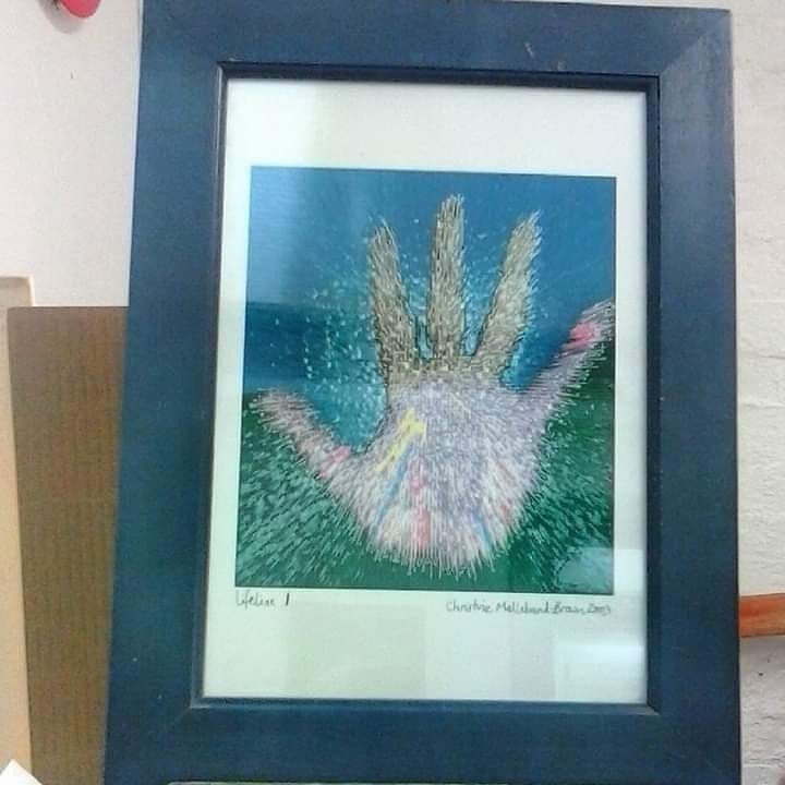
Digital art I did in 2003. It feels very appropriate for the current situation. It’s based on a photocopy of my hand and then I put it through photoshop to add interesting colours and textures. It is called lifeline and it’s on my mantlepiece. I might try and do something else like this….
