Colours

IMG_20200720_183654

Remind me not to play with colours! I have stacks of samples of colours on my phone. Sometimes, like this, I put them together in a simple pattern. Different layers and shapes, folds and twists. I chose rainbow colours, but I think the red is actually a deep orange.

Interesting how colour perception differs from person to person.

I like the way there is a definite hard line seperating each line of hot colours from the blues, greens and purples. Interesting what you can do with photos of carrier bags, tee shirt material, yellow paper, a cleaning cloth and a patterned throw.

Pattern play.

FB_IMG_1594467403346

I don’t know when I did this, probably three or four years ago. It’s a combination of three apps, ArtRage oils, sketcher free and layout. I drew the metallic looking pattern first, then added the spirals and finally divided and mirrored the images.

I probably used a photo editor too. I’m not sure.

The feeling I get from making these gives me great pleasure. I can’t explain, but it takes me out of myself.

X

Patterns

_20200710_214734

Patterned background, created digitally, with a figure of a seated woman added. I like playing with pattern, seeing what I can find hidden in the depths..

I added dark lines then shading and lightened areas to give the figure a bit of definition. I guess it’s a little more abstract than I normally draw. I changed the hue in it a couple of times to. Making it more green and then more red. I enjoy experimenting with art.

X

Triangle

_20200709_200426

Not my favourite challenge, but I looked out of the window and saw various triangles. I rearranged the clothes on the airer so they made definite triangles, and the coats on the cupboard were hanging down in a triangle. I left the standard lamp out because it didn’t help the composition. The acrylic paint I used is quite opaque and as the group I’m in is called Urban sketchers Stoke-on-Trent I felt the sketchy feel was OK. If I had been doing a ‘proper’ painting I would have done a more realistic, painterly I ture. But I was concentrating on the triangles….

Doodles

_20200413_171401

I did these a few months ago. The designs had to include red and black. I was going to send them off to a website but I forgot, got to involved in other things and lost track of time, so by the time I did remember it was too late. Adding more white to both images helped I think because you can see the images more clearly. I’ve always thought two cats would make a good yin yang symbol, and the teapot? Because we live in the heart of the potteries.

X

After Hokusai’s Great Wave

wave hokusai after

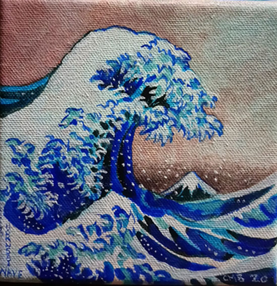
my attempt at the great wave after Hokusai.

I’m writing an assignment about the artist Hokusai and his ink and wood block print, The Great wave, or The Great Wave off Kanagawa produced around 1830. He had previously painted two other great waves in 1803 and 1805. There is a collection of 36 views of Mount Fuji by him.

I found out that he had been influenced by an artist called Shiba Kokan, who in turn had been influenced by Western Art. The Portuguese first started trading with the Japanese as early as 1543 and later the Dutch came along and started to trade with them in 1609.

Hokusai’s first waves were not as stylised as the Great Wave, but over the intervening 30 years he honed his style. His wave painting has a low horizon which gives it a more western and also menacing feel. The wave towers over three fishing boats, threatening to swamp them, Fingers of water claw the air in a very fractal pattern, and a tiny Mount Fuji sits in the background, apparently encircled by a threatening sea and lowering clouds.

Did you know the wave emoji is based on Hokusai’s work, and this in turn is linked to the waving hand emoji. There is a site called emojipedia that gives lots of interesting facts about emoji icons.

I wont go into great detail about the assignment, but I had to link in semiotics and other ways of critically appraising art works. I was up till 4am trying to pull it all together!

x

Art idea

_20200701_183005

What to do with our art group?  The other one I’m part of is doing a Cezanne project based on a still life. Each of us chooses a square (1 of 9) So I wondered if we could do the same in the other group? But we have decided to do hexagons and include our own ideas inside them. I’m looking forward to what people create. Then I will have to stitch them together, maybe in photoshop.

Doing art in lockdown has ket my mind on track. Being in groups of artists challenges me to do different things. It helps my practice, and helps me learn.

Tired from painting

IMG_20200630_184527_355

I’ve been painting a lot over the last few days. I was up till 5am, went to bed but then got up at 11am so I’m really tired. I thought I would take a photo of what I’ve been doing. You can see the contrasts in size. When I took this photo I didn’t know the kingfisher would be sold two hours later. It’s now at a good friend’s. I’ve been asleep half the evening. I wish I had more energy.

As you can see my ideas are many and varied. I was going to do a craft fair this weekend but decided against it as I don’t think it’s safe enough and I’m not happy to risk being out in public. Hopefully I will be able to do another one. Also it’s not a good idea to sell you stock prior to an event. I’m going to do some more but I need a decent night’s sleep!

Wave, after Hokusai

_20200629_220225

Hard to copy, this is a small acrylic on canvas, based on the Japanese artist Hokusai’s picture of a massive wave seemingly threatening mount Fuji and boats fighting the turmoil of the water.

How does he draw that wave? Finger like  curves protrude from the water, white wavelets curve all in one direction. The water becomes a threatening mountain about to collapse. The height of the wave threatens not only the people in the boats, but it even dwarfs Mount Fuji itself.

When did he draw and paint it? He was a famous artist I think for a long time. We’re there other pictures and sea in his career? I think there were.

The image is so well recognised. Type in 🌊 wave on your phone and you get an icon which seems to symbolise Hokusai’s wave and mimics it.

How do you analyse such amazing work. How can you understand it. He makes me wish I could copy his style.