
Sundays #bandofsketchers prompt was busy. I’m busy doing pattern designs for college and this is turning out quite ‘busy’ (complicated, convoluted, patterned) so I think it counts…felt pens then edited through Instagram to bring out the contrast.

New paintings and regular art updates.
Sundays #bandofsketchers prompt was busy. I’m busy doing pattern designs for college and this is turning out quite ‘busy’ (complicated, convoluted, patterned) so I think it counts…felt pens then edited through Instagram to bring out the contrast.

Collage and digital edit on the theme ‘feathers’ for today’s #bandofsketchers prompt. I went a bit mad, using tissue paper, post it notes, gold glitter paint and felt pens. Then I put it through my phones editor to change the contrast and hues.
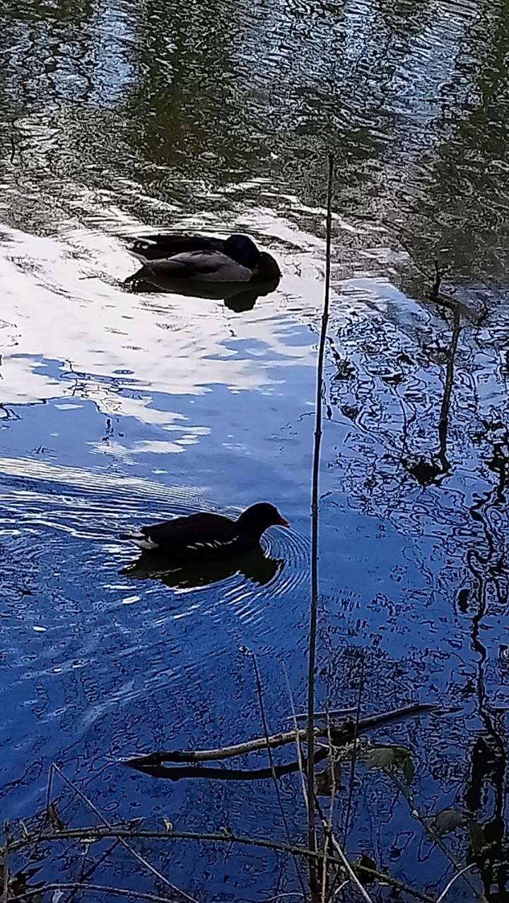
A duck and a coot. If this was a race, the coot is winning. The twig looks like the finishing line for a rowing race. The duck is a Mallard drake, I don’t know if he’s preening or asleep? I love the ripples on the water. My phone camera has reacted to the bright light and has reduced the exposure time so it appears darker. You can move the position of your camera to affect this. If you look at an area with less bright light then the exposure would open up again. But I like the strong contrast in this image and the depth of colour. It’s difficult to see the details on the birds because they are in deep shadow.

Have you tried adjusting the colours in a photo in curves? I had taken a bland photo of a tree outside my window and I decided to see what I could do with it. I wanted to increase the contrast, change the colours, add brightness to bring out where the light was in the photo to differentiate between the tree leaves and the background.
Curves is like a graph, by changing the height and depth of the curves you can enhance brightness and colour by making the curve higher, or lower the curve and the image loses brightness and can lose contrast too….. The curved graph representing this was up and down then back up again. All I can say is have a go and see what happens. You don’t have to accept the result and you can go back to how it was originally.
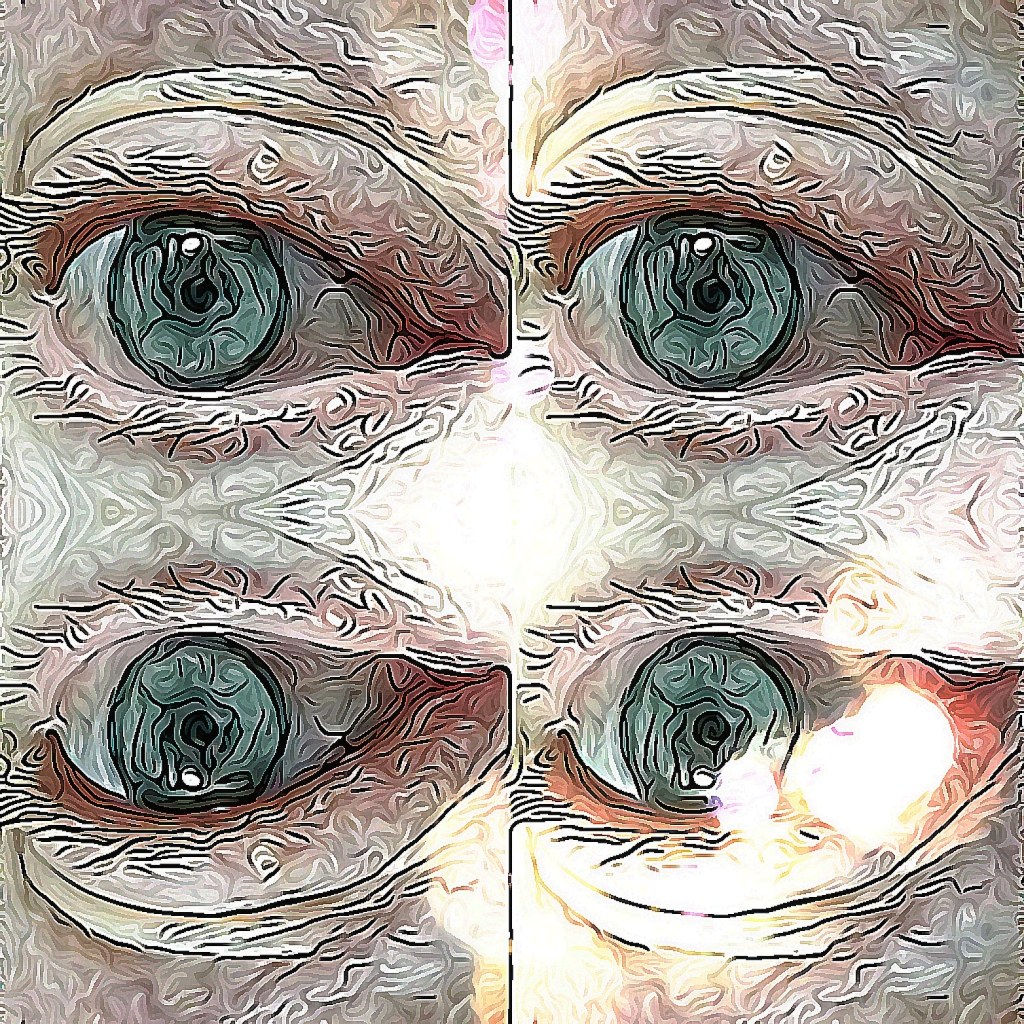
Photo of my eye duplicated then edited in photodirector. Using a brush tool and a style tool. It might not be pretty but I hope it is interesting. I could imagine turning it into a print. The more I play, the more I learn. I like the colours, the shading, the contrast of marks even though they are created by an algorithm. To me it’s fun.

I’d got my paints out so I painted one of our cats on top of the washing pile. He was flat out for a few minutes. The theme is contrast, so I thought the bright colours, including the fluorescent jacket, would make a good contrast. I’m pleased with how it’s turned out.
Acrylic on cartridge paper. Its curled the paper a bit, but when the sketchbook is closed it should flatten out OK.
X
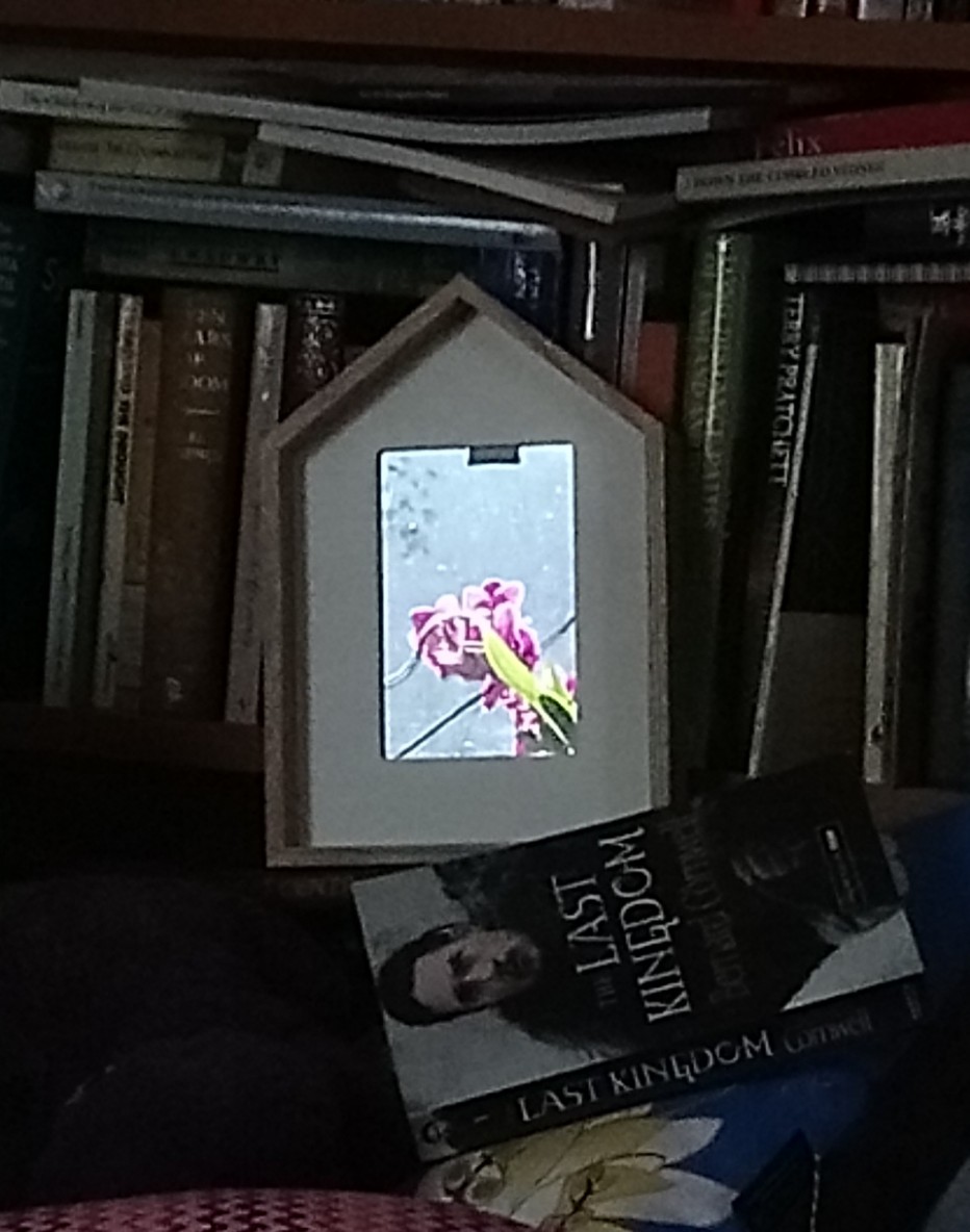
The bright reflection of my orchid plant in a glass covered picture my friend gave me. It’s a close up and it stands out because of the darkness of the surrounding area.. The pink, blue and green stands out bright and clear. I wish my phone camera could reproduce images more clearly when you zoom in. But it was worth taking the photo.
X
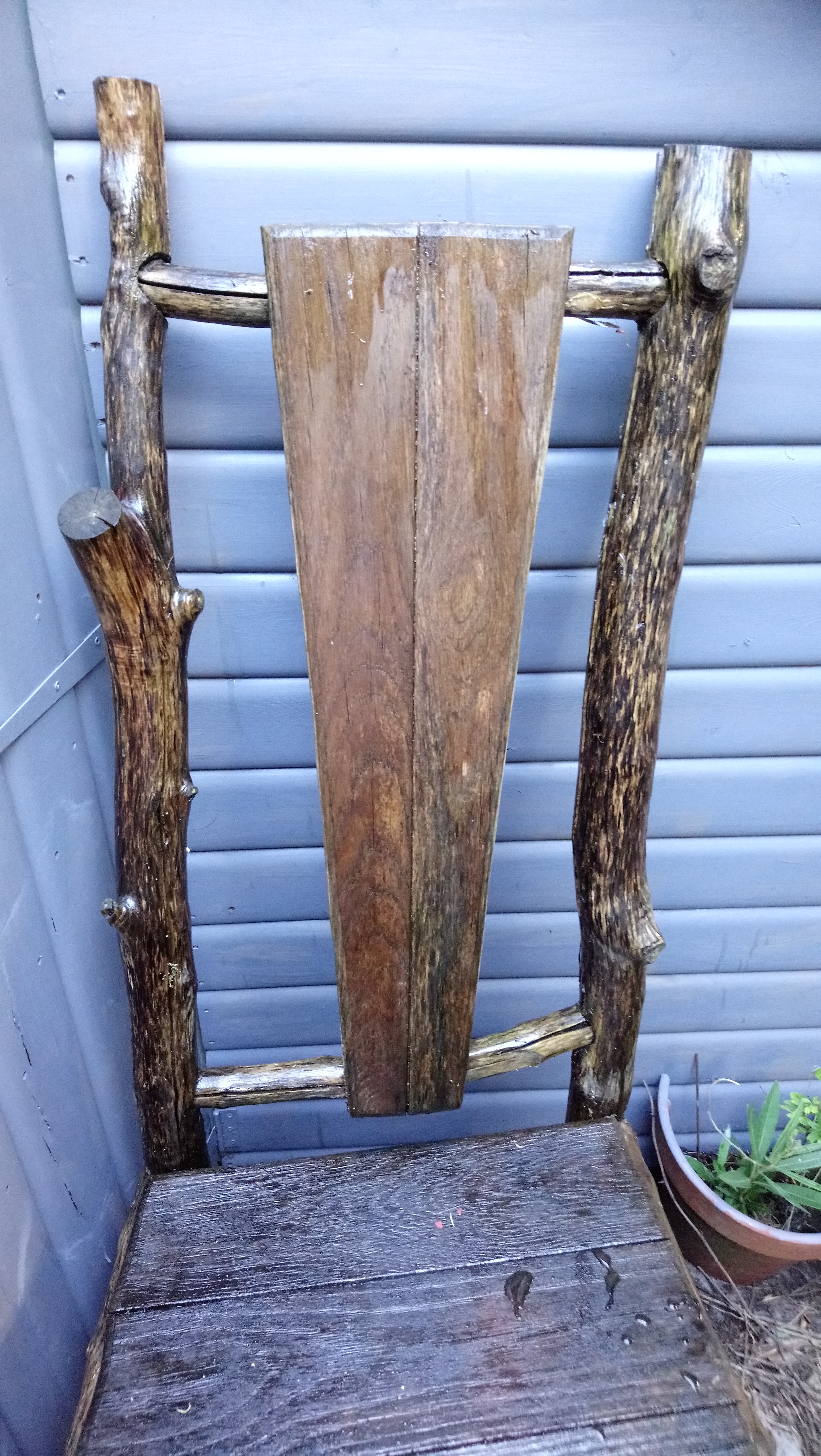
Grey shed (painted in a colour called silver birch) and yatch varnish on an old wooden rustic chair that my hubby got for his birthday a few years ago.
I like the contrast between the smooth wood of the shed and the rough timbers of the chair. Hopefully they will be protected for a few more years.
X

Went down the surreal route (root) with this photo a couple of years ago. This tree ‘pillar’ looks like its holding up a green roof.
Getting an image like this is based on placement of the object in the original picture. If you place a strong pattern in one corner, or in the middle, with interesting contrast or colours, you can multiply it and create something etherial. I like to think this could be a home for elves or fairie folk. Mad, but interesting.
X
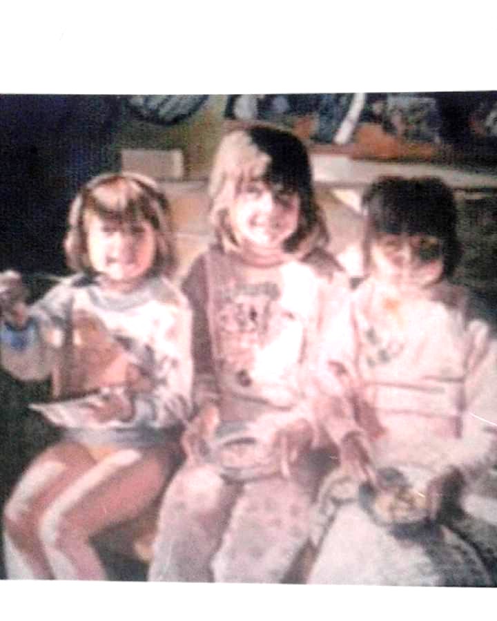
This portrait of a friends three children must be twenty years old or more. All I have as an image is an old photocopy of a photo of it….which is why it’s blurred..
The three children were having breakfast when the photo was taken. There was strong sunlight shining into the room. The main colour was pale pink but the pin board behind them and the deep shadows made a good contrast.
I’d like to share a photo of my painting but I haven’t seen it for years. I used to do a lot more portrait painting but I guess now selfies are the fashionable thing they are less likely to be commissioned.
If you would like a portrait don’t hesitate to contact me.
X
