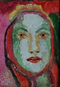
Weird little green face, red hair or scarf. I’m just playing with complementary colours on a little canvas. I don’t know if I will elaborate on it. Maybe I should add extra details? What do you think?

New paintings and regular art updates.
Weird little green face, red hair or scarf. I’m just playing with complementary colours on a little canvas. I don’t know if I will elaborate on it. Maybe I should add extra details? What do you think?
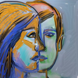
Blue and orange are complementary colours. I thought I would use them to shade this drawing of a profile and straight on face. I like the way the two faces almost merge into one. This is a theme that appears quite frequently in art. It’s also something the band ABBA used when singing! They were not using these colours.

Thursdays #bandofsketchers prompt was chopped. I could have drawn a can of chopped tomatoes, or a tree chopped down. But I wanted to play with ideas so I sketched a loaf chopped in half, I was using the various digital drawing apps that I have on my phone. Seeing if I could import the image between each of them!

Twirling, whirling, swirling.
Artrage app using metallic digital pens and flood fill, then saving the image and adding extra lines to it, then flipping one side so it’s not quite symmetrical. The red and greens are complimentary colours so they stand out against each other where they haven’t blended together.

Group of blocks, duplicated in a symmetrical pattern. I think the blues and oranges of the tiles, which are complementary colours add to the composition, as do the strong diagonals created by a bright shaft of sunlight. This was originally a photo taken in the shop at Middleport pottery, I think taken in the autumn.
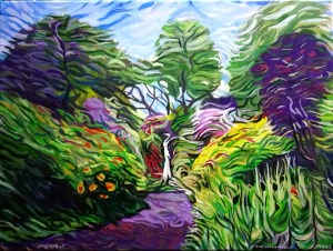
I can’t do more. My brush is wearing out trying to add texture and colour (I exaggerate!) But I need to stop, I don’t want to overdo it. I have plans for a few more in this style. I’m enjoying the challenge of working out how it fits together. Too much texture? Not enough? Are there places where your eye can rest or is it too chaotic? I noticed I was using yellow and purple complementary colours. Can you even tell its a waterfall…. I hope so. Dorothy Clive Garden waterfall in Willowbridge, Staffordshire, England.

Yet again I can see faces in this pattern. Like little dogs faces. The pale green patches with black horizontal lines coulsvbe frogs eyes. I got the colours by playing with ‘curves’ on my photo editor on my phone. I like the way the complementary colours of red and green work together. I could see this as a print on a scarf or even a place mat for a coffee cup or a pattern on the actual cup.

When I posted about my friends garden I forgot to add this photo. Its my favourite picture, the red and green really zings.
I imagine it was very tasty, although I’ve never actually had any.
It just speaks of sunshine and good health. It’s amazing how coloured leaves can be just as intense as flowers. I’ve cropped the edges to accentuate the colours.
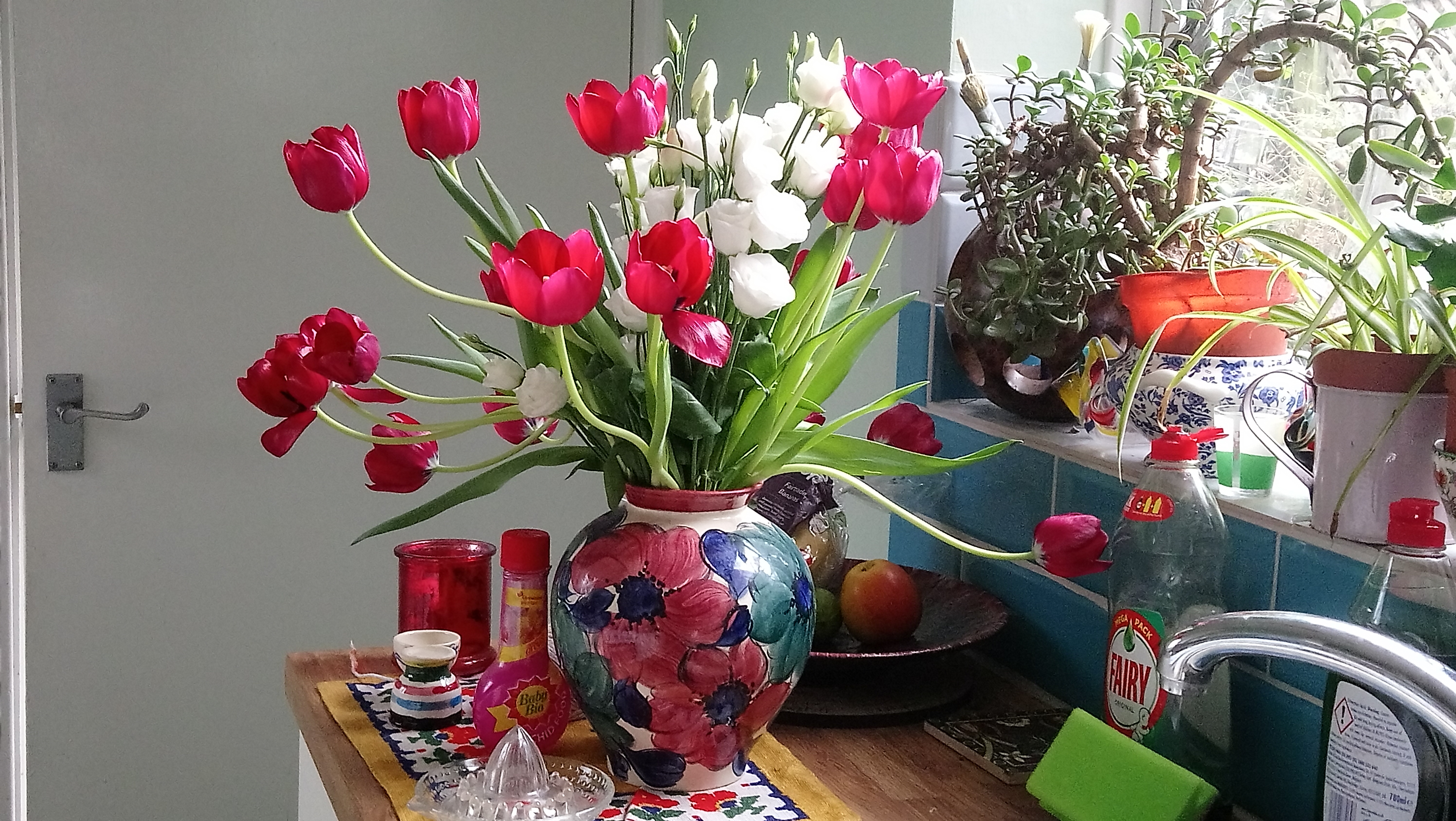
I took this today and noticed how much bright red was in it and subtle greens to compliment it. Even the plant food and bits of the labels on the washing up liquid are red. Splashes of colour lift this photo, making it zing. I was going to crop it, but I also like the door handle on the left side mimicking the curve of the tulip stems. The green leaves and sponge and washing up liquid are complementary. Even the cloth on the cupboard helps to hold it together. More if a still life than a photo. Objects can just spring out at you. Especially when you get a bit of sunshine to enhance the shapes of the vase and tulip flowers.

You might have heard of the colour wheel.. a rainbow of colours running from red to orange, yellow, green, blue and purple.
Red, Blue and Yellow are known as primary colours. These are the ones you can mix together to get Orange (yellow and red) Purple (blue and red) and finally Green (blue and yellow)
There are mixtures that can also make all the different colours of the spectrum.
If you know the theory of colour you also know White is all colours mixed together. This is why if you put a prism of glass in a beam of sunlight it will split the white into all of the colours of a rainbow. Newton did this experiment and helped us understand the nature if light.
On the other hand, Black is an absence of colour, all the colours that hit a black surface are absorbed, they don’t reflect back to your eyes. If you mix up all the colours of the spectrum you tend to get Brown, not as you might expect, Black.
Did you know there are complementary colours? If you spread the primary and secondary colours around a circle split into 6 equal segments you can see how the primary colours are next to one’s of a mixture of them and the next primary. So the wheel ends up with the most contrasting (complementary) colour directly opposite each other.
These are
red/green
yellow/purple
blue/orange
These colour combinations seem to sing, like a discordant chord they bounce off each other.
Some famous artists like Cezanne and Van Gogh would exploit these clashing colours to create strong images. Van Gogh’s blue skies contrasting with the orange of sunflowers makes the paintings seem to glow. Cezanne’s use of green vegetation and red soil has a similar effect.
So sometimes when I paint or draw I will chose to use complementary colours to see what I can create from them.
Of course there are other colours out there. ..the author Terry Pratchett wrote about Octarine, the eighth colour of the rainbow, I think he said it was a purplish black …..
But in reality there are colours beyond human perception. The ones nearest to the spectrum we see are Infra red, which gives heat. You need special detectors to show this colour, and also ultra violet which can cause tanning or sunburn when the uv light is strong enough.
The spectrum continues into longer and shorter wavelengths beyond infra red and ultra violet. But that’s another story….
