
Digital filtered image of the moon over the horizon. I’m trying to make it look like a screen print. I might make a painting of this. The colours and texture appeal to me.

New paintings and regular art updates.
Digital filtered image of the moon over the horizon. I’m trying to make it look like a screen print. I might make a painting of this. The colours and texture appeal to me.

I’ve been working on another painting today. This one is of a canal view which will have Canada Geese painted on it with their reflections. More muted, but still using the idea of texture and pattern. Mainly purples and greens. Acrylic on canvas.
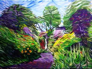
I can’t do more. My brush is wearing out trying to add texture and colour (I exaggerate!) But I need to stop, I don’t want to overdo it. I have plans for a few more in this style. I’m enjoying the challenge of working out how it fits together. Too much texture? Not enough? Are there places where your eye can rest or is it too chaotic? I noticed I was using yellow and purple complementary colours. Can you even tell its a waterfall…. I hope so. Dorothy Clive Garden waterfall in Willowbridge, Staffordshire, England.

Today’s #bandofsketchers prompt was Sea. I tried to draw waves on a sea with felt pens but I didn’t like it so I’ve played with it digitally to add texture in some places and blur other areas. I’m not sure about it, but not all drawings are successful. I think it looks like a photo from a camera with smudges on its lens.
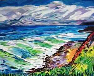
Clouds pile up above a dark blue sea and waves rise, ready to crash against a rocky coast. Cliffs covered in boulders and vegetation stand above a small sandy area.
Having to describe what I have painted is hard, I know what I can see but finding a description that adequately explains it is difficult, especially since I’ve added texture and patterns. I’ve entered it for a local open art exhibition. It’s a bit of a risk, but I wanted to try. X

Using a digital filter can make a difference to an image. It somehow tidies up the image. It adds a different quality to pen lines. This was done with photodirector/effects/style, choice two. Initial drawing was brown and pale green felt pens.

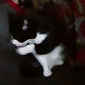
Sometimes even blurred photos work. I used photodirector to add texture to this. Why? Because although it was blurred the colours were really interesting. The contrast of dark reds and greens and pale green and pink seemed to work really well. You can still tell what it is but in an abstract way. In a way its sketching with photography. I think it’s still art.

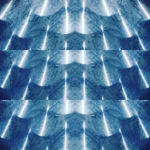
Blue and white digital drawing using the sketch app on my phone that has a kaleidoscope effect, then with added texture using photo director. Reminds me of a ceramic bowl with a repeat surface pattern using transfer printing. The pattern also looks like dancers or iceskaters. It would also look good on fabrics, like a silk scarf.
This is the previous post put through the photodirector app. The image now has contours. You can feel the movement and it feels like an oil painting or a soft dry pastel drawing. I think I like this more than the original.
Reflected on a table top. Polished circles look like metallic scales. A layer of smeared washing liquid leaves a texture and using the layout app on my phone I mirrored and duplicated the images. I almost see metallic blue feathers?
