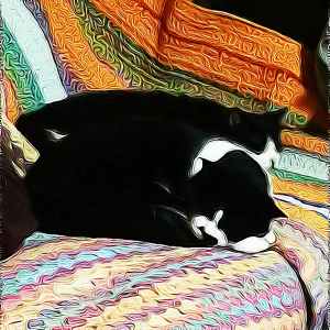
Just two of my cats. Sleepy, edited in photodirector. They are on a crochet blanket. I put the photo through photodirector, I like the textured look it creates.

New paintings and regular art updates.
Just two of my cats. Sleepy, edited in photodirector. They are on a crochet blanket. I put the photo through photodirector, I like the textured look it creates.
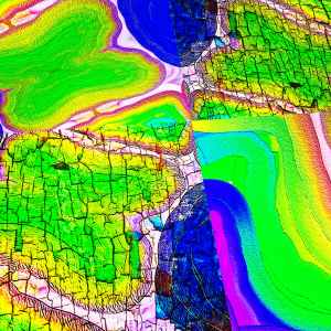
What has this become? Duplicated, added filters, texture, sharpness. Mixed and muddled. Colourful, like false colour terrain. You can have a lot of fun with digital art. I feel like I’m flying over a mad landscape, rather like in 2001 a space oddessy when Dave Bowman flies through an alien landscape near the end of the film. What fun a bit psychedelic! x

Getting placement and colours right. I like this composition because it has red and green complementary colours. But with yellows and blues to jazz it up. I need to sort out the chin and the fence. It needs to go backwards and the face to come forwards. There is detail on the gate and face I haven’t added yet, but the paint is wet and I don’t want it to become too blurry.

Sundays #bandofsketchers prompt was slope. I drew a cat sloping off the page, with a sloped back walking down a slope. Three digital variations…

Playing with a photo of a patch of sunlight. As I put it through a filter I saw the shape of a penguin appear! It appears to be albino and looks like it’s wearing a scarf to keep warm. I can’t see feet or flippers… I do like pareidolia (seeing faces or shapes or animals in shapes). Using the filters creates an interesting texture and gives it a shimmering look, a bit like melting ice? Another random post from my strange mind.

Sleep, memory, chases my mind.
I remember we were twins
When you were still here
Now your shape is gone
A space left in my landscape
So before I weep again
Bring me more dreams of you
Here beside me
Her next to me
Sister, twin.

I haven’t done anything like this for a while, this was six years ago. I drew this in a free app called ArtRage oils and I really like the graphic feel to it. Varying the pen sizes and textures seemed to work well with dark shades and metallic tints. I must try and do something new. I like trying to create exotic birds.

Work in progress. I want to try and get more realism into this. It’s based on a previous painting, but I decided to try and get in closer and give a finesse to the petals texture and the central structure of the poppy. I’ll post again when it’s finished.

A graffiti like image that started as a doodle with pastel and metallic pens. The scratches and textures were created using the photodirector app on my phone. Trying to create something that looks like it could have been painted on a wall and weathered over time.

I’m watching one of the Star wars movies so I thought I’d create a digital image that reflects the power of the film sets. Full of massive architectural shapes and dark power. This though is a plastic star we have hanging in the living room. I’ve duplicated and twisted it, then added texture and overlays of a lightning storm. Figuring out how to produce an interesting image takes my mind off things.
Have a WordPress.com account? Log in now.

