Work in progress

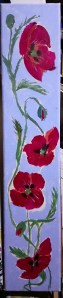
I did a bit of work on this long thin poppy painting too. I need to finish it by next week. I do seem to like putting myself under pressure! I imagine this hung on a narrow section of wall. I want to add a lot of detail and make the poppies stand out against the pale blue background. I hope it has an art nouveau appearance.
My favourite poppy painting

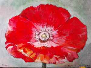
Ten years ago I painted this beautiful flower. I think it’s a type of poppy called Shirley, I grew some from seeds. What I like is the pale centre instead of the usual dark, or black pattern in the middle. I deliberately used a pale background to compliment the light reflected on the petals. When poppies unfurl from their buds they look papery but they are quite strong, not delicate, its just a shame they don’t last very long and soon fade.

Red

Red is the colour I loved as a child. Not pink. I had to have a bright red polkadot dress. I remember seeing a red setting sun for the first time when I was small. I liked red sweets, though I don’t remember the flavour. Red roses were beautiful, and red toffee apples were tasty.

Even now I like wearing red, but I’m a bit more adventurous, liking deep reds and maroons and bright reds. I still don’t like pink though.

Gladiolus

This brilliant red flower spike broke off a gladiolus that was growing in the yard (there are all sorts of plants out there) decided to bring it into the kitchen o we can enjoy it for a fee more days. It’s also an opportunity to consider painting it. I think I might paint it with texture and in close up. Flowers are amazing aren’t they?

Love poppies

Poppies make me smile

They have real style

If I could put them in order

I love white ones with a red border.

I like himalayan blue

I wonder if you do too?

Welsh poppies are yellow

A colour that’s mellow…

Orange from Californian lands

Red sunshine, might grow on sands

But red are my favourite flower

They seem to have a great power.

To me they are iconic

And I’m not being ironic

The colour of Ruby lips

Red blood and rose hips…..

Faces?

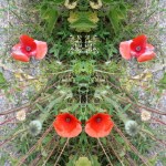
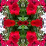
Yet again I can see faces in this pattern. Like little dogs faces. The pale green patches with black horizontal lines coulsvbe frogs eyes. I got the colours by playing with ‘curves’ on my photo editor on my phone. I like the way the complementary colours of red and green work together. I could see this as a print on a scarf or even a place mat for a coffee cup or a pattern on the actual cup.

Skeleton?

A building with red safety rails began to be built two years or so years ago. This steel skeleton was erected within a few weeks. But then Covid struck. Work stopped and never resumed. Instead we are left with an unbuilt block of studio flats.

There is nothing to indicate who the owners are or whether it will be completed. Bits of metal are strewn in the base of the building including a battered wheelbarrow. The security fencing and security gates have been severely damaged and the site is accessible through the broken gate. Whenever it is completed I hope it will be better than the current site.

Horses from splodges

Horses are wonderful animals. They have such amazing characters. When I tried to find something in the matching splodges to the previous post I almost immediately found the large horse head. Then the other two emerged from the patterns. I just needed to add some white, green and yellow to differentiate between them.

Tiger cub

Here’s the tiger cub from paint blots. Stripes were added with ink pen and felt pen. I think it works. I’m not sure about the red as it might look like blood, but it’s only really a doodle so it’s not a serious piece of art. Just a bit of fun. I wonder what I would make of a real Rorschach test?