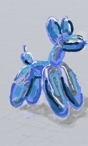
Comparison

I play with these drawings to create a double image of two faces. One side has more texture than the other using different apps.

One side is sharper than the other, the left hand side has been processed through photodirector to add texture.

Does it matter what I did or why? Isn’t it more important to create something? I explain what I’ve done, but is there any significance? I see work in exhibitions wherr the piece of art will have a longwinded explanation of what the Art is about. I like to play and explore, I might not have a specific intention, but I hope what I do has some integrity….

Chopped

Thursdays #bandofsketchers prompt was chopped. I could have drawn a can of chopped tomatoes, or a tree chopped down. But I wanted to play with ideas so I sketched a loaf chopped in half, I was using the various digital drawing apps that I have on my phone. Seeing if I could import the image between each of them!

Variations

Editing a digital drawing that I made in Artrage. I used photodirector to create several variations, then incollage to create a compilation of them so you can see the steps I took.

Does it look like a good portrait? No. Its more of an abstract idea. I could try using this on an actual painting, I will have to decide if I can do it as this is a finger painting again.

Floating cat?

I tried to add a pattern underneath my kitty because he carpet he is lying on was dark and you couldn’t make out the outline easily. But I couldn’t finger paint around the cat very easily. Still I did an OK job. I wanted to add a black and white pattern to this photo of one of my black and white cats.

I love cats , they can be good companions and they are not as aloof as they are sometimes portrayed. I used Houndstooth check which seemed like a good choice. I should really try doing this in photoshop but I’m too tired to fire up my PC.