
Today’s #bandofsketchers prompt was clothing. I decided to design a tee-shirt. Black and white and then coloured with watercolour pencils. I guess it could be printed.

New paintings and regular art updates.
Today’s #bandofsketchers prompt was clothing. I decided to design a tee-shirt. Black and white and then coloured with watercolour pencils. I guess it could be printed.

#band of sketchers today, again. This time with colour. Van Gogh meets Picasso (ish).
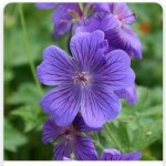
A mix of red and blue
This colour can impress
A historical royal hue
An expensive shade
Until a method
Of manufacturing
Artificial purple
Came into view
Made by mistake
When making Quinine.

Too many flowers
Growing out and round
Hanging baskets
Decked out and grand.
Pots filled with lots
Of colours and shapes
Joy to my heart
These flower baskets make.
A real riot of colour
Blooming in my heart
And the heart
Of the city.
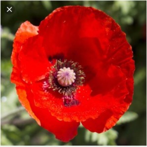
I just love them, their colour, brilliance, shape, papery petals. Colourful flowers that are imbued with sorrow because they were used to commemorate wars. They sprang up in the fields of flanders after the battles there. And yet to me they don’t signify fighting or fears, but memories of summers long gone, my favourite colour and how tiny seeds can create such magnificent flowers.

Like a firework
You spark the garden
Into flame.
Stars sparkle
In a green universe
You are galaxies
Of delight

Tried to get a better photo with shadows cast so you can see the layers. I love this weird combination of colours.
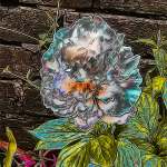
Paeony or Peony? How do you spell it. I changed this photos texture in Photodirector, then changed its hue and saturation and finally used the curve tool to adjust the lightness and shadows. I feel it has a look of embroidered silk or satin. The petals are more defined than the original white flower. I like the yellow and blue greens on the leaves. If this was the true colours I would say that it was an ill plant. But as this is an edit of the original I think it gives an interesting effect.


Had the pleasure of hanging the flower baskets and planting up some pots today. I’m expecting as they settle down there will be a mass of more flowers. Last year the baskets were still partly in flower in December!
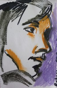
This was one of the portraits I did in a student led portrait group at college during the last few months.
The face was mostly drawn with one of those ink rollers you can use to blank out your address on letters so that you can throw them away without anyone seeing your details and stealing your data. Its quite hard to use because you have to sort of turn and twist your hand and press firmly to sketch curves. AfterId done that I added colour using pastels and the thick black lines were done with black calligraphy pen (most of these have run out so I need some more).
I quite like the strong feel to this. I am trying to find my illustrational voice. I have been told to look for illustrators that my work resembles, but I think mine is different? Is this a good or bad thing? I’m definitley developing my analogue skills. Digital work is more difficult for me.
