
Ink runs
Ink penetrates
It seeps
Through pages
Leaves marks
Makes islands
On the page…
Trap them
Surround them.
Engulf them
Isolate them.
Add contours
Describing their existence.
Then I’m happy.

New paintings and regular art updates.
Ink runs
Ink penetrates
It seeps
Through pages
Leaves marks
Makes islands
On the page…
Trap them
Surround them.
Engulf them
Isolate them.
Add contours
Describing their existence.
Then I’m happy.

A tree I drew for someone a few years ago that she wanted for her business cards. I wish this wasn’t so blurred but I only got a chance to take a quick photo of the finished printed card and I can’t find the computer file it was saved on.
It was a commission for her and she was really pleased with the result. Its funny how you find images that suddenly spark memories. The rainbow type colouration in the background was hard to get right. I think I used a digital spray can to get the softness…

I’m excited, a film about the life of Clarice Cliff, the Art Deco pottery painter and designer has just come out on film. I’ve also found out some of my friends are extras in the film! I want to find out if I can go and see it at a local screening.
Clarice Cliff is famous for designs such as “bizzare” and other geometric shaped pots painted in colourful and stylish patterns. She was working in the 1930’s at the same time as other paintresses such as Suzy Cooper. Apologies for my lack of information. If you look her up on Wikipedia or perhaps the museum services at Stoke-on-Trent City Council. She is very famous here. X
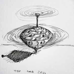
Not feeling on top of the world today so just did a sketch from memory. Today’s #bandofsketchers prompt was Top. I tried to remember what a toy top looks like. I did a sketch with a black ink fine line pen. This is from memory. I can see a bright top spinning in my mind. The top had some holes in so as it span it had a rising and then descending musical tone. Edited in Photodirector to give a slightly abstract effect.

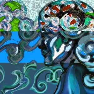
Artrage oils sketch. Using orange, yellow, green and purple to make it pop. Because the colours smudge when you overlap them, it’s hard not to mix them up. Eventually I ended up with this abstract pattern.
Finally I mirrored the image in layout app to create a symmetrical pattern. The colour pallette has a slider for metallic and non metallic versions.
I see lots of shapes in it that could be faces or a cat or other animals or even bodies? Pareidolia again (seeing faces in things)
Is full of confusion
Pattern flies round my head
Variations come and go…
Hard and soft, colours glow
Light and shade
What I’ve made
Begins to flow
To and fro
I see my thoughts
As ones and noughts
Digitally built messages
From analogue sketches

Sundays #bandofsketchers prompt was busy. I’m busy doing pattern designs for college and this is turning out quite ‘busy’ (complicated, convoluted, patterned) so I think it counts…felt pens then edited through Instagram to bring out the contrast.

Oil painting on board of a friend I painted while I was at college. The Mr X refers to his name when he was in a band. I glued the poster to the painting and added an image of one of his pictures in the background behind him. I think I did the painting from life but I don’t really remember, it was painted about 40 years ago x

I was playing about with lines then added the grey infill. What does this remind me of? Tyre tracks! So I can’t say much more than that. I may have some more I can do with this. Or not. It’s only a sketch but it was fun to do. Convoluted complications. X

Digital finger painting.
Done late last night, I was in a doodling mood. I completely covered another drawing I had saved but wasn’t very pleased with. Its interesting to do this because by saving changes I’m not adding a new file and I hope it means I am saving some phone memory. Yes I draw on my phone, so the tiny screen makes it hard to add details.
I think my pigeon has a bit of sass, he’s cheeky and he’s just taking off to make mischief somewhere….
