Back to life

In January I started a back to life sketchbook for my college course. This was day ones drawing, a falcon on my mouse at, pens and my computer mouse. I continued drawing every day from then on, I have done all sorts of drawings and I’m still doing them (today was some ice cubes). That effort has been interesting, sometimes confusing, difficult to maintain if I could not find something to observe and draw. But it has been rewarding. My imagination has been stretched and expanded. My ideas generation has improved. I would recommend drawing everyday to anyone who is interested in art.
My mind

Convoluted

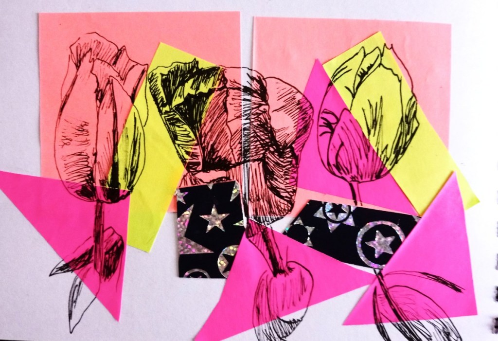
I decided to use bits of post-it notes and monoprint and combine them in a tangle of colours. Do they link up with each other? It is a representation of my MA land. When you work on a college course there is so much to absorb and take in. Lots of information that needs to cross the book/ brain barrier via your eyes. The ever expanding reading list tries to force you to take in knowledge, but it’s not always easy to sift the relevant from the irrelevant. The clarity of words is not always there. I try to write clearly when I’m blogging, but if you have to take a dictionary with you when you try and read a piece of information, then you have to ask whether the author is being elitist.

Other problems with online courses are the lack of face to face contact. You can try and have zoom meetings or their equivalent. But it does feel sometimes like you are working in a vacuum. My desk is tiny, my pc and keyboard and screen take up about 75% of the space. It’s hard to find enough space to work in. My sketchbooks are getting smaller in proportion to the increasing number of them. So much drawing over the last year!

Heart and Love

Small drawing of a heart that I drew on top of a bit of black monoprinting. I’d cut this section out of another bit to create a negative space for a portrait, I’ll post that drawing later. Done during a student led session that just finished tonight. Part of idea generation for the illustration course I’m doing.

One thing I do need to look at is fonts, it’s hard to draw them accurately and I struggle to copy them, and I didn’t have a particular font in mind, just the idea the letters should be red, I might try and make them look a bit more like blood with a fine ink pen.

Architectural?

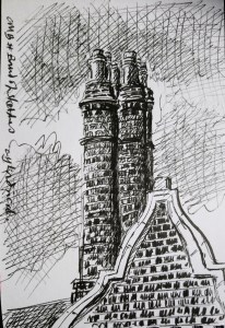
Then Tuesdays #bandofsketchers prompt was architectural. My go to view when I don’t feel like going out is the Portmeirion factory across the road. I used black acrylic monoprint on white printing paper to give it texture and shadow. Then drew over the top and added a bit of pink post-it note.