Spode site

DSC_1996

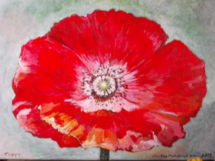
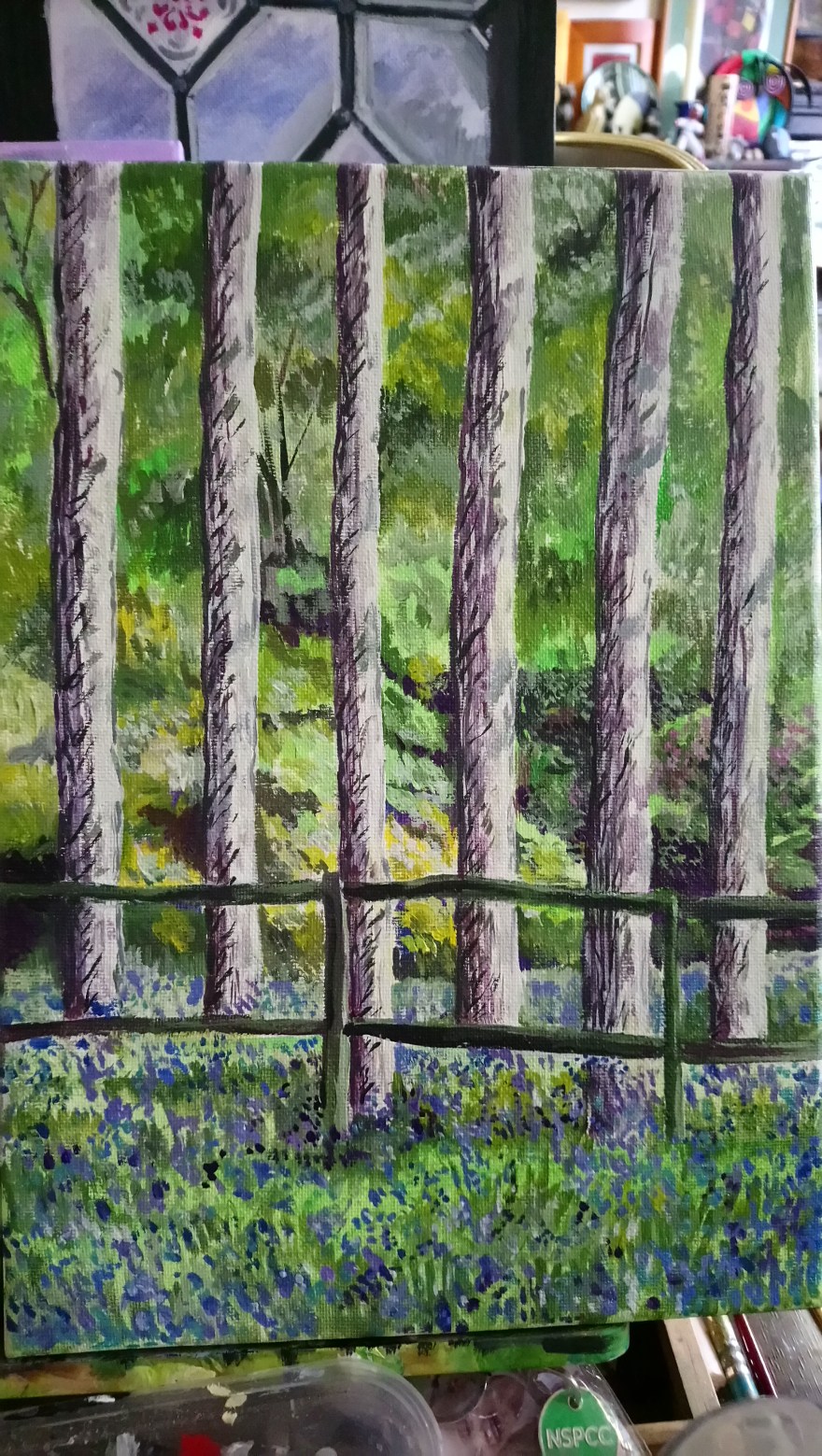
I’ve started work on this painting after a gap of a few months. I think it just over faced me, it was too big, to difficult (I’m working on it by looking at my phone).

And this last few days I haven’t felt well enough, but I started work on it this morning and did a good few hours on it.

So, where am I painting? In the house, not my studio. That’s the other thing, physically I feel awful. Mentally, I’m OK but don’t feel like I want to go out. We went for lunch with a friend today, but came straight home afterwards because I was exhausted, literally shaking. I don’t think I’m getting worse, but it’s taking time to recover and I know I’m pushing myself. But I have an exhibition next week and I haven’t got everything done. It’s very last minute……

This morning I realised it will be forty years in September since I started my degree in fine art painting…and I have never stopped….

X

Portrait from 2000

received_2527961020547879

This is a portrait of Cyril I did in 2000. I hadn’t seen it since then.

But then we went to an exhibition by Cyril Tilston a few weeks ago at Centre Space in the Spode heritage visitor centre. Cyril had a photography show and we got chatting.

He took one of my cards and then contacted me over the weekend. He had found this drawing. We had met 19 years ago at another exhibition. We had got discussed art and I had invited him to a drawing group we used to hold in a local pub. So I must have drawn him at the group.

So interesting to look at my drawing style then. I think my eyesight was better then, my hand less shaky. The lines I drew stronger than now. But I’m glad I still draw and paint. Maybe I will have the chance of drawing him again.

Based on a tile

FB_IMG_1558221491692

This is a digital drawing based on an old tile. I won’t bore you with the app I used it’s on my tablet and I haven’t been able to use it for a while as it needs fixing.

I drew it in 2016 and I don’t think I’ve shared it here before. It just popped up on my Facebook memories, and why not share it? It will just disappear into the aether again if I don’t.

I did try and create a glossy shine on it, but the chin is too big!

X

Favourite flower

FB_IMG_1557997049653

An acrylic on canvas from 2013. This was one of my favourite paintings and I used it as my profile picture for a few years. I’m no longer sure it’s as good as I thought. I would change the background to a darker grey green now to make the red Zing even more.

I think I will base another painting on it though. I’m  thinking of doing a long thin painting that could be hung horizontally or vertically. The design would have to work in both directions and perhaps even upside down. 

Doves

_20190517_211911

I wonder why doves are the symbol of peace? They are beautiful, they are white which might signify purity. The dove was released by Noah on his Ark and came back with vegetation in the Bible story. But that’s is not about Peace. I know Picasso painted the dove of peace many times and it appears on Christian art. But where does it come from. Does it appear in other religions?

For instance why is the symbol of peace not a pigeon?

FB_IMG_1557677867253

Well you never know?

X

Dot dot

DSC_1990

Sparkle, shine, glitter

I was playing with one of my phone picture editing apps and came across something that pixelates in dots not squares.

I turned it into a black and white image, then added colours with a flood fill option in another app. sketch-1558111779786

I did more to it by using my phone editing suite. I went to the curves section which allows you to adjust the colours and brightness and adjusted it to make it more interesting. 

_20190517_175110

I’ve ended up with a dotty abstract.

Purple

IMG_20190517_175227_231

Bright purple, showy, flared.

Full of energy,

Life, fun.

Zing-ING, splashed, clamouring

For attention.

IMG_20190517_181102

Add purple and it blasts through,

Flights of fancy

High pitched song,

Not calm pink

Or barmy blue

Gaudy yellow

Green screen

Orange spice

Ruddy red.

But purple, violet, lavender, plum, grape

Mix blue, red and white

Purple delight

Six trees painting

DSC_1985

Inspired by the Rode Hall bluebell walk we did a week ago. The vertical trunks that were so evenly spaced with the darker fence in front made a striking photo. I’m not sure if I’ve managed to capture that here. Bluebells are a difficult colour to capture. I tried mixing ultramarine with white, then when that didn’t work I used a bit of deep magenta, and also pale Windsor violet. I used a bit of metallic blue to give them a sparkle.

The trees are mainly sap green with yellow and white added.

About 12 x8 inches, acrylic on canvas.

X

Idea for a quilt


Just playing with the abstract pictures I drew, making a butterfly pattern then duplicating it, adding borders as if each piece was sewn together. I think I could make something out of this using cut pieces of patterned cloth using the butterfly as a template. I’m not sure about the colours as it gets mixed into the pattern. I wondered if I added some black to the background.

sketch-1557951177242

I sort of like the more random feel to this. At least I am being creative.

X