By mirroring, changing texture, changing the colour and adding lens flare you can get a whole different, if artificial, landscape. I’m not sure I have made it look natural, I wanted to make it look like I had used a paintbrush and oil paints, but the lens flare is perhaps too sharp. Maybe I should put it through another filter or have I gone far enough.
I saw this film late last night and was enthralled by it. Each individual frame is hand painted in Van Gogh’s style. The son of the postmaster where Van Gogh used to live goes off to try and deliver a letter from Vincent to his brother Theo, after his death. When he finds the brother is also dead he decides to take the letter to the Doctor who was treating Van Gogh before his apparent suicide.
The film covers the year after Van Gogh’s death and shows in black and white flash backs incidents that might have happened between Vincent and the people around him. This is told through a series of conversations between the postmaster son and various characters.
This is a visually sumptuous film in Van Gogh’s style. The Polish/British co-production is stunning and intriguing. The gradual understanding of what happened makes for a satisfying investigation of the circumstances surrounding his death.
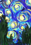
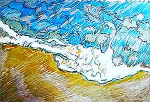
Today’s #bandofsketchers prompt was fluid. I tried to draw a beach scene from above. I used an image off the Internet to give me an idea. I watched an animated film called ‘love Vincent’ about the life of Vincent Van Gogh last night so I’ve also done this with texture. (see second photo).
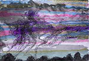
My earlier ‘hope’ drawing with one lot of added texture, a smudge of gundge, then cropped to cut out my writing at the top. It’s amazing how quickly you can change something by just altering them slightly in an app. In this case I used photodirector. It’s OK, some of the stuff on it is too advanced for what I want, but I just use the simple stuff that’s free. What I don’t like is how a lot of art sites charge a monthly fee instead of letting you buy a package like you could in the past. Over time it adds up, and I can’t afford that.
Red glitter glue poured in a spiral then dragged out with a small piece of wood. I finally put the image through photodirector to change the texture. Yes I know it looks like a splodge of ketchup… I really want to take a photo of the glittery surface, but my phone doesn’t want to capture it!
Messing about with plastic dots glued down, then worked on it in layout app (a mirroring app) and then photodirector to change the texture and twist the perspective. Back to layout to mirror the result. Different colours and patterns seemed to create a horned dragon at the centre. I can see his nose and eyes, although part of his face appears hidden…. Having fun…
I used photodirector to adjust the textures in the effects part of its editing tools. I like the rippled effect, it somehow reminds me of the patterns in the cloudscape on Jupiter taken by the Juno probe a few years ago. Because I didn’t shade all the way up to the outlines I like the dark edge that lies between them and the silver shading. I could imagine using this style to illustrate a book cover or within a magazine article. Perhaps one day I will get a commission to do something like this? I don’t know.
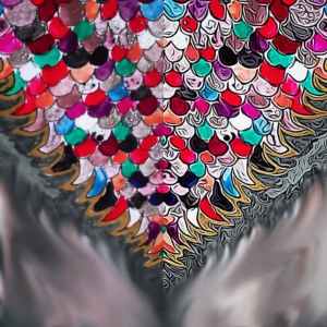
Experimenting again with dragon ideas. This one is made up of a drawing coloured in with different nail varnishes and then duplicated and mirrored after adding texture digitally. The blurred section had the words ‘dragon scales’ written on it but I decided to blur that out.
Each of these experiments will be added to a portfolio of images that will go towards my final major project for college.
This textured doodle took me about an hour and a half to draw. I tried to change the patterns on it using line and soid black, curves and squares. Trying different line thicknesses. I cannot decide which way round this should be? I don’t think it really matters?