6 years ago, teapot

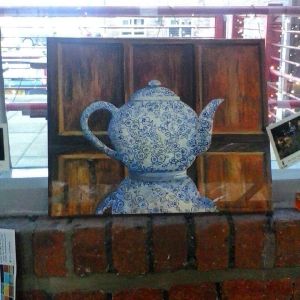
I painted this teapot six years ago when I first moved into my studio at Spode. This is a medium sized acrylic on canvas. It’s from my imagination, and the flower design is based on the pattern ‘calico’ by the Burleigh pottery. I think its based in Burslem, Stoke-on-Trent. I made the wooden panels up from my memory. I still have this painting at my studio at Spode.

Play using photodirector

I started drawing circles, then decided to run it through several iterations of photodirector using it’s AI style button and adding a background of butterflies, then sending it through the AI texturiser again. I think it makes a quite gentle image, I like the colours, enhanced in the Clarendon Instagram filter. I do enjoy experimenting.

Mug design

Badly drawn mug with a photo superimposed on it. I was just trying out the idea of what would work on a mug. I’m sure there are templates so you can see how things would work, but I don’t know which application is the best to choose? I think spoonflower and red bubble have them but I don’t know of there is a charge to use them. The pattern is a collage of a photo of my crocheted blanket, it was square so I had to draw curves so the top and bottom fitted into the shape. It might work?

Trying to add a mosaic round the cat.

My cat was lying, belly up, looking at me. He was on the Sunday papers so I decided to add a mosaic to the background. The only problem is the tool has a pointer that magnifies where you are drawing but it doesn’t line up with the edge of the image. It also means a lot of filling in if you use a small nib, and overlap if you use a larder one. It means if you try and draw round the outline of something like the cat it often overlaps and you have to use the back toggle or add a bit of extra drawing to cover over the uneven areas. Still it looks better than when he was sprawled on the newspaper.

Comparison

I play with these drawings to create a double image of two faces. One side has more texture than the other using different apps.

One side is sharper than the other, the left hand side has been processed through photodirector to add texture.

Does it matter what I did or why? Isn’t it more important to create something? I explain what I’ve done, but is there any significance? I see work in exhibitions wherr the piece of art will have a longwinded explanation of what the Art is about. I like to play and explore, I might not have a specific intention, but I hope what I do has some integrity….

Patterning

Symmetrical doodle, could be a vase? I love pattern, I found the flood fill on my sketchbook app, using gradient and radial fills. I can’t work out how to change it from black, grey and white. But I think it sort of works? I was trying for a picassoish line effect although there are no bits of anatomy from animals and humans like his abstracts have.

Patterned

Artrage drawing played with in Incollage and Instagram. You can do all sorts of things by playing with a digital image, you can make interesting patterns and skew and tilt images if you try. I have often done things like this quite frequently, but it’s a while since I’ve created something like this.