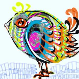
I used to draw a lot in an app called sketcherfree but I haven’t used it for a while. Perhaps it is time to find it again. Using different styles frees up my mind!

New paintings and regular art updates.
I used to draw a lot in an app called sketcherfree but I haven’t used it for a while. Perhaps it is time to find it again. Using different styles frees up my mind!

Using filters you can vary colours and styles. I used a photo editing app but also photodirector. I placed all four images together using the Instagram Layout App. I know I keep going on about these editing programs but it’s because I think they can make a difference to my art without me losing my originality. The source of the image is usually one of my drawings, paintings or photos. It’s like adding layers of style to my creative ability.

Today’s #bandofsketchers prompt was factory. This is the view from our window across the road to the factory. They have trees and plants in front of it to screen it a bit. The tree is covered by ivy at the moment but the buds are already showing ready for spring.

I see
Cats
Butterflies
Dragons
Old bones?
I see
Rock
Pebbles
Sandy beaches
I see
Vasesu
Urns
Ancient columns
I see
Holes
Bubbles
Veins
I see
Lacunae
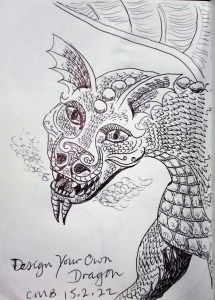
I’m trying to come up with different Dragon designs. This was today’s idea. Batwing ears, crocodile type skin and scales, smoke gently streams from its mouth. I’m not sure how large it is? It could be two feet long or twenty meters! I’m pleased with it.

Ten minute sketch while watching #skylandscapeartistoftheyear. It was of the Forth Bridge, although one of the towers looks like its collapsing! One of the reasons it was quick was because I wanted to watch the show and see what the artists did. You can’t do that while you are drawing. I enjoyed it very much.
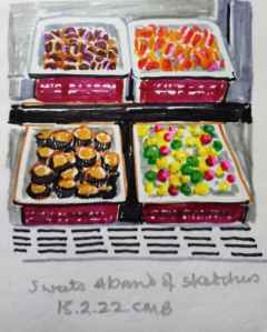
Indian sweets at Nafees in Shelton, they look so tempting but I got some Samosas instead because I’m not really allowed a lot of sugar. I asked permission to take a photo. I used new felt pens and a new sketchbook… The start of a new adventure. #bandofsketchers prompt for Tuesday ‘sweets’


#bandofsketchers prompt for Sunday was bright lights. I tried, but there aren’t many bright lights near where I live so I made up a Las Vegas sign, didn’t like it so put it through a digital filter….increasing the brightness, colours, adding texture.

Playing with complementary colours. I like red/green and blue/orange but a favourite is this combination yellow/purple. I yexturised the original pattern then mirror ed two of each, original and textured. Interestingly the colours seem to change as I used the texturising filters so I put them through Instagram to boost the intensity of the colours. It’s just a fun pattern.
Thursdays #bandofsketchers prompt was Station. Very quick sketch of Cheddleton Station from a photo. I used a picture as its probably not open to the public till Easter but we’ve been there and on the train several times.

