
I’ve been working on another painting today. This one is of a canal view which will have Canada Geese painted on it with their reflections. More muted, but still using the idea of texture and pattern. Mainly purples and greens. Acrylic on canvas.

New paintings and regular art updates.
I’ve been working on another painting today. This one is of a canal view which will have Canada Geese painted on it with their reflections. More muted, but still using the idea of texture and pattern. Mainly purples and greens. Acrylic on canvas.
Finished for now. My painting of Westport. I may do a bit more work on the sky. It needs to settle on me. I mean I need to look at it and decide if it needs tweaking. My closest explanation of this style is that it’s like painting through a pane of swirled glass….

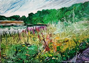
Another in the textured landscapes series I’m creating. After getting the first painting accepted into the three counties open exhibition in Burslem School of art, I now have the opportunity to put some paintings up for sale at the Etruria Industrial Museum cafe. I decided to try and use a similar style to create colourful and striking landscapes. I’m using a different size of pattern, smaller than the Waterfall painting and more intricate. I want to evoke wild flowers in a summer landscape with Westport Lake in the distance.

Sundays #bandofsketchers prompt was Stones. I thought of drawing one of the members of the Rolling Stones but decided against it. Since I’m using a new sketchbook and I’ve been painting in acrylics this afternoon I decided to conjure up some stones from my imagination using the colours I’ve been using in the paintings.
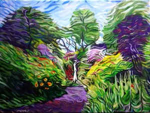
I can’t do more. My brush is wearing out trying to add texture and colour (I exaggerate!) But I need to stop, I don’t want to overdo it. I have plans for a few more in this style. I’m enjoying the challenge of working out how it fits together. Too much texture? Not enough? Are there places where your eye can rest or is it too chaotic? I noticed I was using yellow and purple complementary colours. Can you even tell its a waterfall…. I hope so. Dorothy Clive Garden waterfall in Willowbridge, Staffordshire, England.
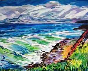
The day is coming when I have to take my painting ‘coast’ into the Burslem School of Art so that it can be hung for the three counties open. I hope it will be OK and be displayed in a good place.
I’m thinking of doing a series of these paintings in this style. I might do some images based on the pottery factories in this city. Stoke-on-Trent is known as the ‘Potteries’ and it might be good to celibate its history. I will see.

I cooled down enough today to do some work on the waterfall painting based on the Dorothy Clive Garden. I’m trying to get movement and texture into it. I’ve been busy today, painting the sides of the Coast painting which I need to take to the three counties open exhibition in Burslem tomorrow. I have still got to add mirror plates onto the back of it so it can be hung. I need to add more colours to this painting to reflect the wonderful view we saw back in May. I’m enjoying learning more about how to use this style. Someone’s said it looked a bit like a Van Gogh but I hope it has a bit of uniqueness to it.
Today’s #bandofsketchers prompt was World. This is an alien world, all colours and patterns, drawn in black fine liner pen then shaded in felt pens. Finally digitally filtered with photodirector to give it texture and make it more alien looking.
Today’s #bandofsketchers prompt is hot. dragon is back in my new sketchbook. This one is purple playing ‘hot’ jazz! Ink blotted into the sketchbook then outlined with black fine liner pen and white pencil crayon to add shading.


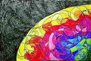
Red velvet coloured eye. Digital doodle, just playing with monochrome colours using one part of the spectrum, a deep red and it’s associated colours with added black and white. I tried to make it look three dimensional to give it a realistic effect. Not bad for a digital finger painting.
