Texturised

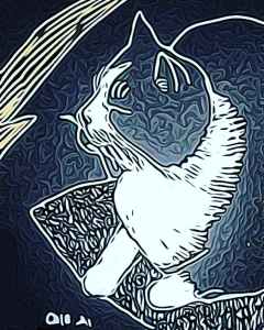
I used photodirector to adjust the textures in the effects part of its editing tools. I like the rippled effect, it somehow reminds me of the patterns in the cloudscape on Jupiter taken by the Juno probe a few years ago. Because I didn’t shade all the way up to the outlines I like the dark edge that lies between them and the silver shading. I could imagine using this style to illustrate a book cover or within a magazine article. Perhaps one day I will get a commission to do something like this? I don’t know.

New pens on black paper

I do like new pens

I spotted five metallic pens made by Bic in the shop today. So on a whim I bought them. I have to say I was impressed! They have large felt pen nibs and the ink flows well. The lines you can draw are a good weight and if you tip them on their side you get wider lines because they have a bevelled edge. The colours are strong and they seem to work well on my black cartridge paper sketch pad, they are nice and opaque. I will see how they work on white paper next.

Three years ago…

Walking around the world museum in Liverpool three years ago, I was so impressed by the travelling exhibition of the Chinese terracotta warriors. Obviously only a few if them were represented in the gallery, but it gave a strong example of the creative and military civilization behind these figures.

There were crowds at the gallery, people shuffled round and many of the exhibits were partially hidden by bodies that strangely mimicked the warriors remaining in China as they stand within the archaeological dig there, rows and columns lined up. Humans used to congregate. They group, they press against each other, travel together . That feeling of community has been lost to some degree because of Covid. Will they ever do the same again? Will we go forward in time to a freedom we do not enjoy now? I don’t know.

Pattern time. Jazz

Felt pens can make interesting patterns, and this was one I created which I called jazzy.

It’s hard to know where the triangles and lines should go and which colours fit together. Stripes and chevrons. Highlighted lines to try and add depth. Abstract art isn’t just splodges, I think it has to have some thought, at least that’s my opinion.

I should have been doing some art today, but I’m not well so I thought I would share this.

Didn’t walk!

Not just that. I woke up with incredible stomach pains and let’s just say I’ve lost a lot of weight today!

It feels like every day is three steps back at the moment. Just as I make plans, things go wrong. Could it be the mirror my hubby broke last week? As Halloween approaches has he cursed us with seven years bad luck?

This is the first time today I’ve felt able to blog. I’m hoping this will only be a twenty four hour bug. Time will tell as the cliche says…

Simple scales

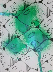
Pattern making again. Using greens ink spray that has a sheen to it. Then I drew scale patterns over the top. Finally I wanted three simple elements to add to each scale or tile that would give it an art deco? feel. So I added a wave shape, a dark patch and some vertical lines. With these patterns I think the scales started to look a little like birds.

Autumn

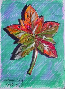
Today’s #bandofsketchers prompt was autumn…. I imagined a wet autumn leaf because I didn’t feel like going out looking for one! Felt pens and silver ink.

I do like challenging my visual memory to draw things like this, thinking about how colours change on leaves. The texture of them, how the veins run in them. It might not be accurate but its fun.

Pattern

A digital drawing, but done on an app I don’t use anymore. I can’t remember what it was called, but it was changed radically by the people that ran it and it became much less painterly and much more patterned filters. In the end I could not get on with it. I lost the enjoyment of it. When I manipulated images I could not create patterns like this anymore. Eventually I gave up and deleted the app about three or four years ago.

Verticals and horizontals

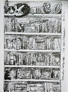
That was what today’s #bandofsketchers prompt was. I have three large bookcases in our living room so I drew an interpretation of them. I couldn’t see all the titles let alone draw them all. I also added cat. It’s a bit scribbly and decided to leave the drawing as black and white although I am tempted to colour it.