Singing

I went to the one to one session with the opera singer. I explained that Parkinsons affects your voice and throat muscles so I’m trying to keep singing as much as I can. She got me to warm up my voice, showed me how to stick my tongue forward to relax it and allow myself to hit higher notes. I was surprised at how high I could get.

Singing in front of a professional musician was nerve-racking but she was so kind and very complementary about my voice. I don’t think I’ll ever be professional myself, but it taught me ways to improve my technique. And it was wonderful to try something new and exciting. It also made me feel less anxious about my health.

Stumpery

Old tree stumps can be used to create something like a rockery in a garden. This photo was taken at the Biddulph Grange garden last year. I’ve also seen this technique used in other gardens and there were some stumps created at Trentham Gardens last year too. I guess the stumps give an interesting effect, especially when they are covered in green moss. They can be interplanted with shade loving plants including ferns. The appearance is like seeing shedded stag horns scattered and stacked neatly along the path at the Grange.

Have you noticed?

Big feet?

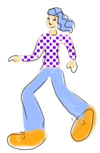
I keep seeing cartoons of people with tiny heads, small bodies, long legs and big feet. Why? it’s fashionable I guess, artists and illustrators are as susceptible to that as anyone else. But is it lazy, or is it what clients are demanding? I can imagine a conversation, “we like your work but can you tweak it?”, “how would you like it?” can you exentuate the feet and make the face small? “,” OK “….

I can understand the concept, the viewpoint is low down, a bit like when a child looks up to a parent. It also makes the subject figure appear stronger because it towers over it’s surroundings, like a giant with seven league boots striding over a diminished landscape. But to me? It’s getting boring. There is no nuance, the parts of the figures are like cut out pieces of paper, no real shading.

There are various illustration programmes that allow you to stitch together a figure by dragging and dropping various elements to ‘build’ a figure and it’s environment. Like other AI and tech systems it’s taking over from real artists and real interesting designs. It’s basically safety as opposed to unique ideas. Dumbing down another profession. I appreciate it makes life for clients easier, but where is the innovation?

Digital cat

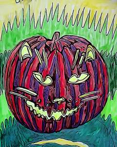
Using a digital filter can steady down analogue drawings. The splodginess of felt pens can get blurred out and the line work becomes more even. I used photodirector to change this drawing. I used the ‘effects’ AI filters and I think I used filter number five on the landscape choice. Somehow the top of the pumpkin looks like a bat….

Horse painting

As I listened to the continuing news of the Queen’s death I decided to recreate a digital drawing a couple of days ago as a painting. It’s not exactly the same, but yet again I’m focusing on pattern and trying out the experimental style that I have been using recently. See what you think?

Landscapes joined

I joined two photos and blurred them with photodirector to give them a blurred, oily effect. I like the way the clouds have become puffed and swirly. The line between the trees and sky has darkened and become almost castellated. Some subtle blues on the left side flow slightly into the right. I like the way things are slurred and smoothed. I just like it.

Variations

Using filters you can vary colours and styles. I used a photo editing app but also photodirector. I placed all four images together using the Instagram Layout App. I know I keep going on about these editing programs but it’s because I think they can make a difference to my art without me losing my originality. The source of the image is usually one of my drawings, paintings or photos. It’s like adding layers of style to my creative ability.

Loving Vincent

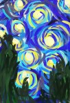
Attempt at Vincent Van Gogh’s style

I saw this film late last night and was enthralled by it. Each individual frame is hand painted in Van Gogh’s style. The son of the postmaster where Van Gogh used to live goes off to try and deliver a letter from Vincent to his brother Theo, after his death. When he finds the brother is also dead he decides to take the letter to the Doctor who was treating Van Gogh before his apparent suicide.

The film covers the year after Van Gogh’s death and shows in black and white flash backs incidents that might have happened between Vincent and the people around him. This is told through a series of conversations between the postmaster son and various characters.

This is a visually sumptuous film in Van Gogh’s style. The Polish/British co-production is stunning and intriguing. The gradual understanding of what happened makes for a satisfying investigation of the circumstances surrounding his death.

Release date: 2017 (United Kingdom)Directors: Dorota KobielaHugh WelchmanMusic by: Clint MansellBox office: 42.1 million USDAwards: European Film Award for Best Animated Feature Film