Tried to draw Frida.


Have you ever tried to draw on a computer with your finger? That’s how I did this on my tablet computer using a sketcher app.

I tried to accurately draw Fridas’ features from a self portrait she did with a bird, cat and monkey. I’m afraid my skills did not let me draw the cat or the monkey, and I know this is not accurate but I had to keep flipping between a photo of a painting and the drawing. So I hope Frida fans will forgive me.

The drawing was prompted by some recent news that a room in Fridas house had been opened up after 40 years of being sealed. Apparently there are many unseen peices of work by the artist.

I could try and put more details into it but I have decided to leave it for now.

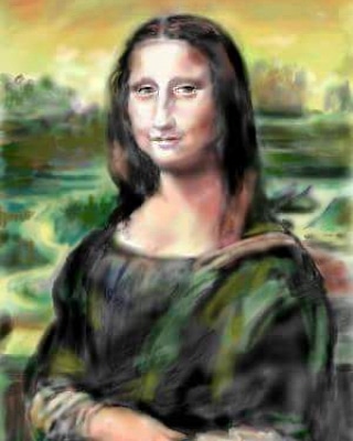
Mona who?

IMG_20180617_110130_887

I tried to copy the Mona Lisa on a digital platform once, unfortunatley the image is a bit blurred. The landscape behind her is perhaps too fuzzy.

Leonardo da Vinci was a brilliant renaissance artist. His paintings and drawings have always enthralled me. There is so much skill there. So much beauty and knowledge. Leonardo has a wonderful technique which I could not hope to copy. My drawing is blotchy, and thin in places, but I think it probably took me about half an hour to an hour to draw. Using a drawing app on Sketchfu.

This was another on that popped up on my Facebook account which I was glad to retrieve. I thought I had lost it.

So anyway I will just leave this here..

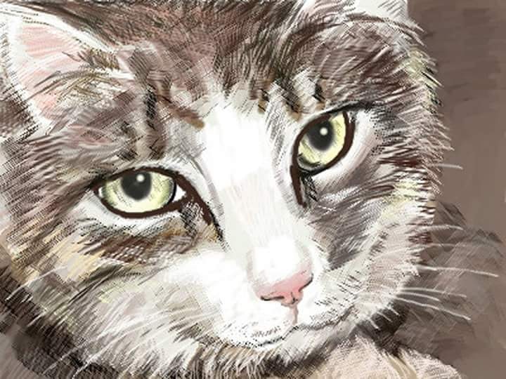
Cat sketch

IMG_20180617_131054_888

Pounce, purr, play, prowl,

Hide, hunt, hop, howl,

Bright, black, brown, bowl,

Occult, ocular original owl.

Nose, naughty,  named Noel,

Sweet, silly, soft soul.

Chilled, cheeky, cat, cruel,

Leap, lithe,  light, lol,

Food, fine, feathered, fowl.

Sharp, sleek, strong, seal,

jump, jink, joy, jowl.

Can’t think of any more rhymes for prowl…. I used owl because I was thinking of their exceptional eyesight

X.

Roses

Roses are red

Violets are blue,

This doesn’t rhyme

I dont know why!

Roses have such an important role in life, they are a symbol of love, lijd red roses for valentines day. They can be sent to patients in hospital, and are a beautiful addition to a garden. Roses are used as an image on greetings cards and can also be found as part of traditional canal art.

People always seem to want to retire to a cottage where roses grow around the door. I tend to think you might get spiked on the thorns if you are not careful.

Roses are red, but they can also be in many other colours, from palest white to almost black. Some roses have sweet scent, others are without perfume. Some flower continuously through spring, summer and into autumn while others bloom only once a year.

I am interested in trying to paint or draw them, their convoluted petals are a real challenge. How they intertwine, whether they are simple flowers like the dog rose, or more complex like hybrid tea roses.

The plants can be used formally, for instance in a rose garden with box hedges , or scrambling or climbing up trellises and trees. They will grow up a pergola and give scented shade in the summer. They can also be used as ground cover.

Don’t ask me about pruning, black spot, aphid attack or other problems because I don’t know….


Complexity

Complexity enchants me, it excites me, it tickles my mind. Complexity is deep within my soul. To illustrate this I have added some digital drawings that I have played with. I started before these with a roughly drawn profile which did not have gender or age. After working on it with a smudge tool I decided to use picsart to change it and blend it into something new. I feel like it is now a profile of a boy.

I used a colour transformation tool in picsart to bring out more vibrant blues and purples. Only when these were set did I go into changing the styles in another part of the app. Eventually I put the drawing through layout which us another app to multiply it up.

Complexity comes through the various iterations, colour, texture and tone being changed each time. I go by feel to decide when to stop, I don’t want to go too far so the picture becomes a bland mush,  but I did try and push it as far as I could.

Portrait session

We had a lovely sitter tonight called Debbie McAndrew. She is an author and play write and also sometimes acts. She wrote a brilliant play called “dirty laundry” that was on last year . It was set in the past and was about the history of the potteries.

We had an entertaining session drawing her and discussing all sorts of things, including how she got into the theatre and acting and how the group got into drawing and painting.

I really enjoyed the session and think that I got some relatively accurate portraits from it.

I used pencil, charcoal pencil and black ink to do the drawings.  The sketches are in a small sketch book with good thickness cartridge paper.

I like drawing in these books. There is enough room to fit the drawings in, and they are small enough to hold so that it is not a struggle to hold the book. Other people were using A1 or A2 sheets to draw or paint on but I prefer the smaller size. About A5.

Anyway I shall just leave you to decide if you like them…

In my friends garden

I took these photos in a friend’s garden 6 years ago (they came up on my Facebook feed) I am a nut about colour and some of these just zing!

I think I used a little digital camera with no added features to take these. I was just amazed how the reds and oranges stood out in the green.

I wish I could time travel back to those simpler times. But time flies, tempus fugit, and before you know it you are 6 years older and perhaps not wiser!

But in the meantime I’m going to enjoy browsing through these again…

Cheers x

Poppy painting

This is a painting I did 6 years ago outside in the garden. I love these large poppies. I had decided to  paint outside because it was a beautiful day and why not paint in situ instead of from a photo. I think then decided to take photos of the process. I guess I painted the poppy first as it was the focal point of the painting.

I added all the other flowers to make it more interesting.  One of the things with creating art is the idea if artistic licence. The other flowers were in different parts of the garden and I wanted to add their colours to the mix.

I’m not sure whether I like this painting, its a bit flat, maybe I should have used more shading as the colours are all of very similar tones, but I was looking at a shady garden and the light was changing over the time it took to paint it. it reminds me of an illustration in a book or magazine, I almost coukd see it next to a children’s story.

I love to paint, and it is always a challenge to improve.

Colour contrasts….

You might have heard of the colour wheel.. a rainbow of colours running from red to orange, yellow, green, blue and purple.

Red, Blue and Yellow are known as primary colours. These are the ones you can mix together to get Orange (yellow and red) Purple  (blue and red) and finally Green (blue and yellow)

There are mixtures that can also make all the different colours of the spectrum.

If you know the theory of colour you also know White is all colours mixed together. This is why if you put a prism of glass in a beam of sunlight it will split the white into all of the colours of a rainbow. Newton did this experiment and helped us understand the nature if light.

On the other hand, Black is an absence of colour, all the colours that hit a black surface are absorbed, they don’t reflect back to your eyes. If you mix up all the colours of the spectrum you tend to get Brown, not as you might expect, Black.

Did you know there are complementary colours? If you spread the primary and secondary colours around a circle split into 6 equal segments you can see how the primary colours are next to one’s of a mixture of them and the next primary. So the wheel ends up with the most contrasting (complementary) colour directly opposite each other.

These are

red/green

yellow/purple

blue/orange

These colour combinations seem to sing, like a discordant chord they bounce off each other.

Some famous artists like Cezanne and Van Gogh would exploit these clashing colours to create strong images. Van Gogh’s blue skies contrasting with the orange of sunflowers makes the paintings seem to glow. Cezanne’s use of green vegetation and red soil has a similar effect.

So sometimes when I paint or draw I will chose to use complementary colours to see what I can create from them.

Of course there are other colours out there. ..the author Terry Pratchett wrote about Octarine, the eighth colour of the rainbow, I think he said it was a purplish black …..

But in reality there are colours beyond human perception. The ones nearest to the spectrum we see are Infra red, which gives heat. You need special detectors to show this colour, and also ultra violet which can cause tanning or sunburn when the uv light is strong enough.

The spectrum continues into longer and shorter wavelengths beyond infra red and ultra violet. But that’s another story….

Homage to Escher

FB_IMG_1528193669141

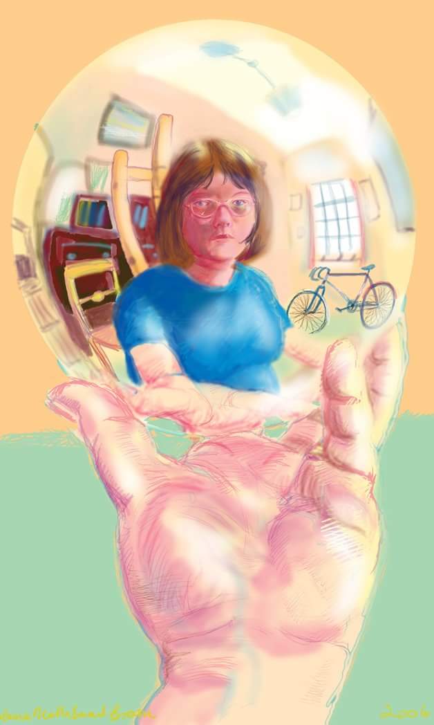
This is a digital drawing I did in Photoshop in 2006.

The image is based on a self portrait drawing by M C Escher.

I have not included any of his lithographs and mezzotints as I am not sure about copyright on them. But you probably know them, and I would recommend looking his work up on Wikipedia if you haven’t seen them before.

From flights of birds or shoals of fish intricately drawn so they tesselate and move past each other, to water flowing downhill infinitely, people walking up and down stairs that twist and turn worse than in Harry Potter… Eschers work is mind expanding, exciting, exhilarating!

The lithographs I have seen are in black and white. Reality is skewed, people move in 3 dimensions, but at impossible angles. Up and down are confused.

Each picture is intricate, tiny details immerse you in an alien world. This is amazing art from the past, do have a look at them if you can.

See this link for further information:

https://en.m.wikipedia.org/wiki/M._C._Escher