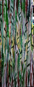
After completing three paintings in two days I had some left over paint. I started painting stripes and realised that if I added small leaves the picture would look like an abstract view through reeds. I think it looks quite different to the others but I like it.
Final work in progress for tomorrow. Its a painting of Jessie Shirleys Bone and flint Mill at Etruria Industrial Museum. Using a similar technique to the other three. I have been working hard on them all.
I sometimes get painting fits where I paint for days. This is one of them. I have an idea in my mind and I want to explore it. I also think it’s the influence of my illustration course I just finished. I have realised I can experiment and come up with more ideas when I’m painting.
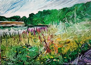
I’ve been working on another painting today. This one is of a canal view which will have Canada Geese painted on it with their reflections. More muted, but still using the idea of texture and pattern. Mainly purples and greens. Acrylic on canvas.
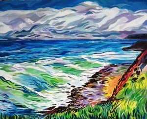
Finished for now. My painting of Westport. I may do a bit more work on the sky. It needs to settle on me. I mean I need to look at it and decide if it needs tweaking. My closest explanation of this style is that it’s like painting through a pane of swirled glass….
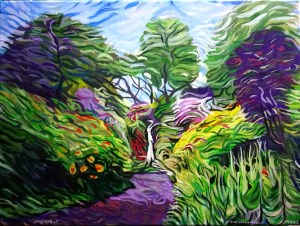
I can’t do more. My brush is wearing out trying to add texture and colour (I exaggerate!) But I need to stop, I don’t want to overdo it. I have plans for a few more in this style. I’m enjoying the challenge of working out how it fits together. Too much texture? Not enough? Are there places where your eye can rest or is it too chaotic? I noticed I was using yellow and purple complementary colours. Can you even tell its a waterfall…. I hope so. Dorothy Clive Garden waterfall in Willowbridge, Staffordshire, England.
The day is coming when I have to take my painting ‘coast’ into the Burslem School of Art so that it can be hung for the three counties open. I hope it will be OK and be displayed in a good place.
I’m thinking of doing a series of these paintings in this style. I might do some images based on the pottery factories in this city. Stoke-on-Trent is known as the ‘Potteries’ and it might be good to celibate its history. I will see.
I cooled down enough today to do some work on the waterfall painting based on the Dorothy Clive Garden. I’m trying to get movement and texture into it. I’ve been busy today, painting the sides of the Coast painting which I need to take to the three counties open exhibition in Burslem tomorrow. I have still got to add mirror plates onto the back of it so it can be hung. I need to add more colours to this painting to reflect the wonderful view we saw back in May. I’m enjoying learning more about how to use this style. Someone’s said it looked a bit like a Van Gogh but I hope it has a bit of uniqueness to it.
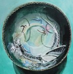
I’m trying to find a gentle way of explaining how I am feeling today. My stomach is growling like a dragon in a bowl!
I don’t know what caused it, but I did put some slightly ‘off’ milk on my porridge a couple of days ago because I thought it tasted OK. One of the problems of losing my sense of smell several years ago means my taste perception is not very good. For instance I can’t smell burnt toast. And I wish I could smell the scent of night scented stock. Its so long since I really smelt flowers properly….
Anyway, I’m babbling on, ignore me! Stomach cramps make me feel fed up (pun intended). Hope the dragon calms down soon, I think I will have a nap.
New painting, based on the lower photo of Dorothy Clive Garden waterfall. I’m working from a filtered photograph of it that has added texture to it. I will try and post an update later. I was trying to find an image to work from for the afternoon at the Orme Art Group today. I was worried about the yellow and green and purple colours, are they to muddy….? But now I’ve started adding a pop of red in places I’m happier. It is something that is making me happy, so I will carry on.
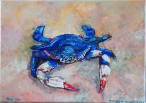
I said I would post a picture of this finished painting of a blue crab when it had got to its new home. I tried to make it accurate but its quite hard to work out the fine details. I also brightened the blues and toned down the sandy background. I made the area behind the crab softer so that it goes backwards out of focus and added more detail to the foreground. It’s new owner is pleased with it I think.