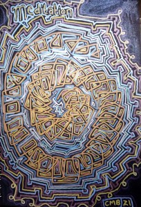
Today’s #bandofsketchers prompt is meditation. I wanted to do pattern to meditate on? I was trying to draw a mandala but it went a bit shaky and sideways. So I embellished it. Using various metallic pens.

New paintings and regular art updates.
Today’s #bandofsketchers prompt is meditation. I wanted to do pattern to meditate on? I was trying to draw a mandala but it went a bit shaky and sideways. So I embellished it. Using various metallic pens.
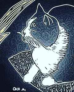
I used photodirector to adjust the textures in the effects part of its editing tools. I like the rippled effect, it somehow reminds me of the patterns in the cloudscape on Jupiter taken by the Juno probe a few years ago. Because I didn’t shade all the way up to the outlines I like the dark edge that lies between them and the silver shading. I could imagine using this style to illustrate a book cover or within a magazine article. Perhaps one day I will get a commission to do something like this? I don’t know.

I spotted five metallic pens made by Bic in the shop today. So on a whim I bought them. I have to say I was impressed! They have large felt pen nibs and the ink flows well. The lines you can draw are a good weight and if you tip them on their side you get wider lines because they have a bevelled edge. The colours are strong and they seem to work well on my black cartridge paper sketch pad, they are nice and opaque. I will see how they work on white paper next.
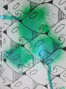
Pattern making again. Using greens ink spray that has a sheen to it. Then I drew scale patterns over the top. Finally I wanted three simple elements to add to each scale or tile that would give it an art deco? feel. So I added a wave shape, a dark patch and some vertical lines. With these patterns I think the scales started to look a little like birds.
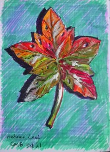
Today’s #bandofsketchers prompt was autumn…. I imagined a wet autumn leaf because I didn’t feel like going out looking for one! Felt pens and silver ink.
I do like challenging my visual memory to draw things like this, thinking about how colours change on leaves. The texture of them, how the veins run in them. It might not be accurate but its fun.
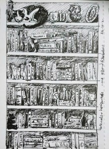
That was what today’s #bandofsketchers prompt was. I have three large bookcases in our living room so I drew an interpretation of them. I couldn’t see all the titles let alone draw them all. I also added cat. It’s a bit scribbly and decided to leave the drawing as black and white although I am tempted to colour it.
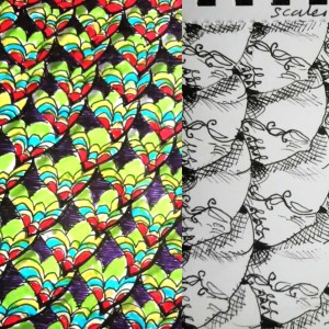
Scales again, I was playing with combinations of colour and black and white. I’m building a large collection of them. Maybe this is enough? Next step is to hang them on my character. Discussing the idea with others I might do a dragon that changes throughout the book. Not because I can’t draw it from different angles, but because it might need to change depending on its circumstances….. Hmmm, I keep seeing new directions!
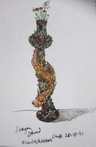
Dragon ‘stand’. Stand was today’s #bandofsketchers prompt so I drew a gardinair stand which is a black and red stand with green leaves and silver highlights. The dragon is meant to be gold or bronze. This was drawn from my imagination.
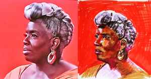
Tried drawing Karen Gibson, the conductor, in felt pens after watching her having their portrait painted in #skyportraitartistoftheyear tonight. The hair is wrong, her left eye is too far back, but I don’t think it’s too bad. I drew with felt pens because one of the contestants had done. This took me about twenty minutes. I should have possibly taken longer.
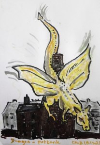
I’m getting obsessed with dragons, thus is a quick sketch of one slithering down a bottle oven at a pottery. I’m imagining it’s been attracted by the heat as the oven is heated up to fire the pottery. I probably should have a plume of smoke coming out of the top of the oven. My dragon is golden like the luster on victorian pottery. I think my dragon is a friendly one.
Have a WordPress.com account? Log in now.

