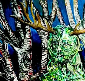
I’m painting a green woman and I’ve been trying to sort out how to differentiate the foreground figure from the background trees. I’ve accentuated the stripes on the bark and made them more black and white than in reality. Since the figure is abstracted in a different way I think it’s starting to work.
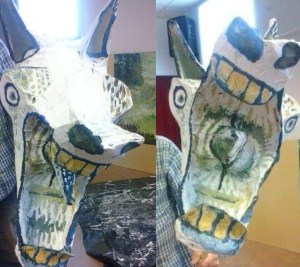
The props for the penkhull mystery plays were made using willow withies tied and glued and then covered in paper and glue and painted white, then volunteers decorated them. I had fun giving a couple of horses a Picasso feel. I don’t remember if it was me or another volunteer that painted this one. There were four horses for an apocalyptic scene! I think we made a monster too but these are the photos from 9 years ago off Facebook memories.
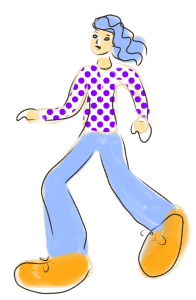
I keep seeing cartoons of people with tiny heads, small bodies, long legs and big feet. Why? it’s fashionable I guess, artists and illustrators are as susceptible to that as anyone else. But is it lazy, or is it what clients are demanding? I can imagine a conversation, “we like your work but can you tweak it?”, “how would you like it?” can you exentuate the feet and make the face small? “,” OK “….
I can understand the concept, the viewpoint is low down, a bit like when a child looks up to a parent. It also makes the subject figure appear stronger because it towers over it’s surroundings, like a giant with seven league boots striding over a diminished landscape. But to me? It’s getting boring. There is no nuance, the parts of the figures are like cut out pieces of paper, no real shading.
There are various illustration programmes that allow you to stitch together a figure by dragging and dropping various elements to ‘build’ a figure and it’s environment. Like other AI and tech systems it’s taking over from real artists and real interesting designs. It’s basically safety as opposed to unique ideas. Dumbing down another profession. I appreciate it makes life for clients easier, but where is the innovation?
Adding some swirliness to mimic a digital style I like. Why shouldn’t digital and analogue ideas merge? I’m not channelling Van Gogh, just having a bit of fun with texture. I’m going to calm down the Green glasses and add some silver or gold to them… I need to work out how the sky will look. But now… A rest!
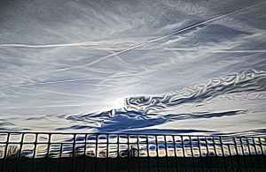
I put a sunset photo through the photodirector app (styles) and liked this result. The effect seems to be like oil on water, fluid but blocky. The colours are subtly concentrated in patches and the line edges are more curved.
There are about seven options for textures so I went through them all to choose the one I liked best. Some of them are more smudged than others.
Using a simple filter can change images. I didn’t use the full strength of filter on this because the contorted lines it created was overwhelming. Instead I turned the filter down to about 40%, it gives the photo a bit more mystery I think…. Photodirector style number two filter.
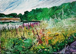
I’ve been working on another painting today. This one is of a canal view which will have Canada Geese painted on it with their reflections. More muted, but still using the idea of texture and pattern. Mainly purples and greens. Acrylic on canvas.
Finished for now. My painting of Westport. I may do a bit more work on the sky. It needs to settle on me. I mean I need to look at it and decide if it needs tweaking. My closest explanation of this style is that it’s like painting through a pane of swirled glass….
Using filters you can vary colours and styles. I used a photo editing app but also photodirector. I placed all four images together using the Instagram Layout App. I know I keep going on about these editing programs but it’s because I think they can make a difference to my art without me losing my originality. The source of the image is usually one of my drawings, paintings or photos. It’s like adding layers of style to my creative ability.
I saw this film late last night and was enthralled by it. Each individual frame is hand painted in Van Gogh’s style. The son of the postmaster where Van Gogh used to live goes off to try and deliver a letter from Vincent to his brother Theo, after his death. When he finds the brother is also dead he decides to take the letter to the Doctor who was treating Van Gogh before his apparent suicide.
The film covers the year after Van Gogh’s death and shows in black and white flash backs incidents that might have happened between Vincent and the people around him. This is told through a series of conversations between the postmaster son and various characters.
This is a visually sumptuous film in Van Gogh’s style. The Polish/British co-production is stunning and intriguing. The gradual understanding of what happened makes for a satisfying investigation of the circumstances surrounding his death.