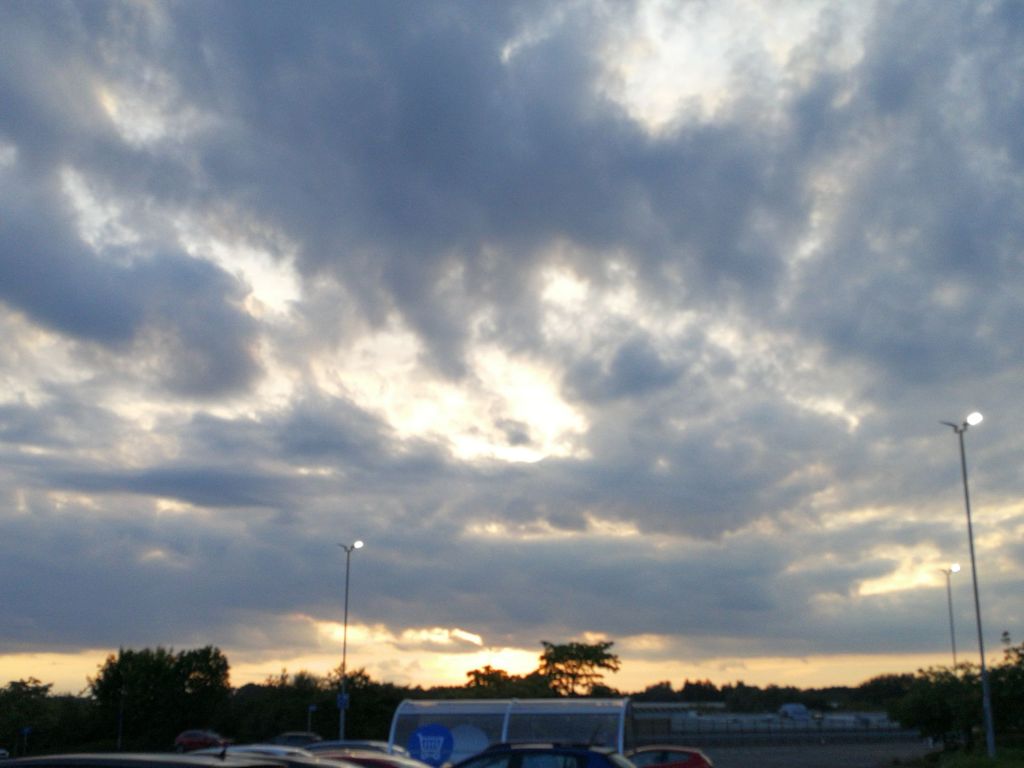
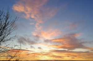
Zoom in

Playing with symmetry and light. The green is from an aurora a few months ago, the orange is from light reflected off the fence outside the kitchen window at night. I liked framing it in a circle, it looks like I’m zooming in on the centre of the space and it’s fuzzy enough to indicate movement. I like exploring ways of creating art and images. You don’t always know what to expect.

Soup?

Someone sent me this photo of lentil soup and suggested I try it but I wasn’t up to following the recipe. But I did like their photo. Apologies if it is copyright but I don’t think so? The table was visible in the original and the dinner mat was twisted but I straightened it up a bit and cropped it to lose the table. I just like the orange bowl and the thin blue line round the edge. It just seperates the bowl from the white and yellow of the mat.

Sunset 19 June 2024

Looking out over a supermarket car park.

The sky had clouded over, but there was a glow from the setting sun behind the grey clouds. It just shows that a minimal landscape can be enhanced by light and colour. There is blue and grey, orange and yellow, purples and blacks all intermingling and changing by the minute.

For once it wasn’t raining, it wasn’t cold, and it wasn’t windy. You could stand and watch the atmosphere evolve as the sun set. It’s not a very exciting sunset, but I enjoyed it.

#forest

Painted last year from a photo of an autumn wood. I’m in another group of artists on Facebook that does weekly prompts. This week was #tree, #trees, #forest, #forests. What gripped my attention was the russet, orange and bronze leaves on the forest floor and following the contours of the deeply worn pathway through it. Some paler leaves are still clinging to the trees, and the distant foliage is pale blue to send it backwards (I might have used pale grey but I liked using the complimentary colour to the oranges.

More tiles

I thought I’d show you the other photo of the church floor I took last night. It’s a bit blurry but this is the main block of minton? tiles. It’s hard to tell what the central section depicts. I love the contrasting blues, oranges and terracotta colours. Using complementary colours makes the image pop even with using only blue and orange.