Thursdays #bandofsketchers prompt was nature. We have lots of trees in our garden. A lot of cherries have blown off our tree, so I drew some still attached! I took a photo but the colours aren’t quite right because it’s dark in here (trying to save electricity)….
I started this last year. It was recommended as a way of bringing more positive thoughts to my mind. I have done it for 323 days now and there’s no sign of me stopping. I’m most of the way through my third sketchbook. I draw a sketch for each of three gratitudes and a short description of what I’m grateful for.
The idea is you don’t write big gratitudes, but little ones so you don’t feel put off by not having a big enough thing to write about. So on one day I wrote that the traffic lights were on green and I got to the doctors in time. For that I drew the traffic lights. Another could be that the cat came up and was very loving. I drew a curled up cat. Finally I wanted something else to write, and the plants in the garden were lovely so I wrote that and drew some flowers.
I have continued to do this each day, sometimes I forget, but it’s a good habit for me to keep to and it has helped me to keep things together. So if I’ve forgotten I will catch it up. It’s become that important to me. It’s going to mean a lot of gratitude sketchbooks though if I carry on!
a numerical scale for expressing the magnitude of an earthquake on the basis of seismograph oscillations. The more destructive earthquakes typically have magnitudes between about 5.5 and 8.9; it is a logarithmic scale and a difference of one represents an approximate thirtyfold difference in magnitude.
Last night around 8pm there was a small earthquake near Tean in Staffordshire. It registered 3.3 on the richter scale, and houses near to it felt a jolt and their windows rattled.
My friend just asked if we felt anything? No, we didn’t feel a thing. We probably get more shaking from traffic driving past our house. Apparently the UK gets about a thousand earthquake s or tremors a year, and most are only 1 or 2 on the richter scale (or 30 or 900? times smaller). So although 3.3 is high in the UK it’s not bad. I think we may have had a 5 a few years ago.
I couldn’t find an image to use so I drew a ‘geological’ abstract instead, trying to draw something like a fracture or fault moving in the rocks below us….
What’s the most delicious thing you’ve ever eaten?
A knickerbocker glory in the cafe at the top of the Great Orme mountain in Llandudno in Wales.
Why? It’s the only one I ever ate, I was a child, and I was amazed by it.
A tall cold glass with a long spoon, a fan shaped wafer in the top. Vanilla ice cream, fruit (I think cherries and peaches), chocolate and raspberry sauces, and fresh cream…. Well that’s how I remember it! We had gone up on the cable car and it was a real adventure. I think we were staying in Rhyl and had a day trip down the Coast to Llandudno.
I remember deep blue sea and bright blue sky, tall houses and wide, quiet roads. The cable car was scary but fun and the cafe had cool drinks and ice-cream for sale.
I don’t know if I ate the whole knickerbocker glory or if I shared with one of my sisters? It seemed to be huge. I think we chose it because of the picture on the menu? It certainly cooled us down on that hot sunny day. Fifty years later.. I still remember…. Delicious!
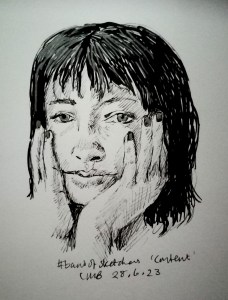
Tuesdays #bandofsketchers prompt was Content. I struggled with this, then looked up ‘content’ online. I found a lot of content faces. This is based on one of them. The drawing is done in fine black ink liner pen. I tried shading with it. Photo taken in quite a dark room so the brightness /contrast is a bit off.
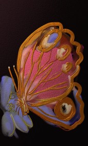
I just drew this… I saw a red admiral butterfly outside and wanted to take a photo of it, but it flew off. I decided to draw something against a dark background to make it stand out more. This was drawn in the Artrage app I use, it gives nice metallic effects, hence the abstract look of this butterfly.
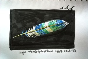
Sundays #bandofsketchers prompt was Wing. I drew part of a wing….. A made up feather. I misread the prompt as flight (how?) I don’t know, so I was thinking flight feather, but I think it still works?
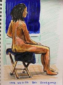
Life drawing, 30 minute sketch with the Orme Art Group. Felt pen and water colour pencil sketch. Dark blue acrylic paint curtain courtesy Steph from the group. Back to work again in a min!
Cheap, cheerful and quick! Found some pictures of pansies online and rememberd how much I loved them as a kid. So yet another felt pen (cheap and cheerful) sketch. Another #bandofsketchers prompt completed.