Negative

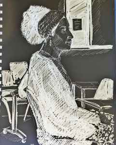
When you use filters it can create some quirky effects. It’s hard to tell which shape is a chair back or my coat (it was my coat on the back of a chair). Also it’s difficult to know how much shading to use. Will the result be delineated so you can tell where the models arm is? Should I have done less hatching? I think I used the negative space quite well. It’s always worth exploring ideas.

Cat washing

The problem with drawing cats from life is that they move! They get into interesting positions and shapes then a second later a different leg is up in the air or they have turned round, head up, down, twisted. Eyes open, eyes closed. The trick is to outline the drawing first, filling in the black area afterwards. This was a five minute sketch. Late night, the cat is settling down for a sleep. I do try and draw from memory but it doesn’t always work, especially with cats!

1950’s style?

A pattern I drew (top) and the same digitally textured with photodirector (bottom). I’m not sure what pattern I would call it, but it looks a bit like boats with sails and a setting sun. I could try and colour the lower curves blue, the ‘sails’ red and the sun (blob) yellow, or try different colourways. Maybe swap the red and yellow over? Whatever the colour I just like the play with pattern.

Using dots for shading.

Sometimes hatching won’t do, so I use dots to shade things. It still creates a slightly darker tone than white. It fools the eye into thinking there is grey there (a bit like half tone in newspapers). I love the 1960’s pop art paintings where they used half tone dots to emphasise the graphic design style of them. Black felt pen on cartridge paper.